Latest on Load Monitoring – Video & FREE Templates
Sean Williams was kind enough to provide short review of the recent load monitoring workshop, held at the World Rugby Science Network Conference, as well as to provide full slides and Excel templates. This is tremendous resource for those interested in injury prediction analytics. Enjoy
Click HERE to download Slides and Excel templates
The link above contains the resources and slides from our recent load monitoring workshop at the World Rugby Science Network Conference, which was hosted at the University of Bath. All of the presentations from the morning session are available to watch bellow.
This includes my talk on ‘Modelling the load-injury relationship: Latest evidence and future directions’, which hopefully provides a good introduction to the load monitoring workshop content. Unfortunately, the workshop itself was not recorded, but I hope that providing the resources and this written summary will be helpful.
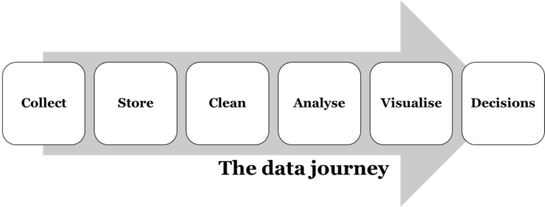
The aim of this workshop was to present and discuss our ideas about collecting and analysing load data. In particular, Dr Dan Weaving (@DanWeaving) presented the following framework to describe the ‘data journey’, and his experiences of the challenges involved in getting through this pathway in his role as a sport scientist at Leeds Rhinos.

We then spent the rest of this session going through each of these stages one-by-one, discussing the challenges involved at each step, and presenting some ideas and tools to overcome these. The worksheets we went through in this session are detailed below:
1. RSNLive17_EWMA-worksheet
The purpose of this worksheet was to highlight the differences between two methods for calculating the averages used within the acute:chronic workload ratio; rolling averages and the exponentially-weighted moving averages (EWMA). My talk in the morning session highlighted some of the key issues here. This example data demonstrates how the EWMA approach may be more sensitive to workload spikes, and also how it ‘decays’ smoothly downwards towards zero when you stop applying loads, in a manner that appears to be more reflective of our physiology than the rolling average method.
2. RSNLive17_analysing-time-lags
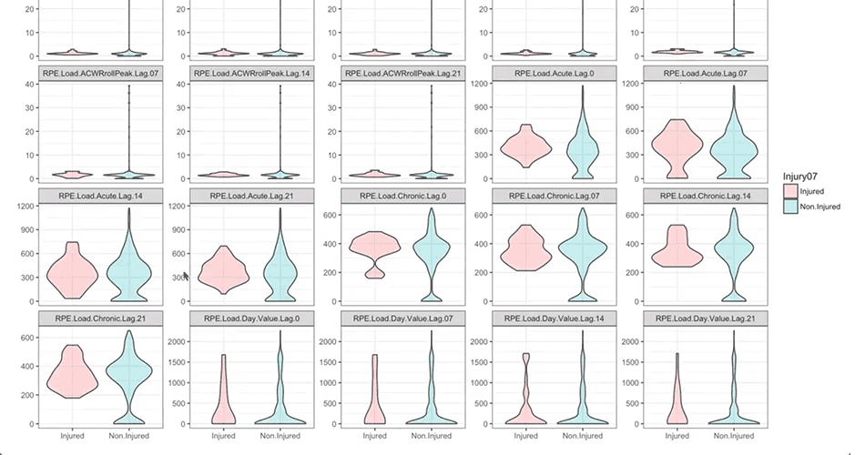
This worksheet was used to discuss the methods in which we account for the time-lag between workloads spikes and subsequent injury risk in our analyses. Whilst it appears to be well accepted that such a lag exists, I don’t feel there is a consensus on how to account for that in an analysis. The example worksheet shows weekly load and injury data. The ‘Subsequent.Injury.1Week’ variable shows one approach for offsetting the load and injury risk, so that a load in a given week is now being associated with an injury in the subsequent week, rather than the current week. The ‘Subsequent.Injury.4Weeks’ shows the same thing but for a four-week time-lag; my concern with this approach is that we are artificially inflating our injury count (i.e., sample size) by a factor of four. The ‘Four.Week.Peak.ACWR’ variable uses an array formula to pick out the maximum ACWR value from the preceding four weeks. This could then be modelled against the original injury indicator (column H) to overcome that inflation issue. We didn’t come to an answer as to which approach is best, but did conclude that we should start explaining our method around this aspect within our research papers.
3. RSNLive17_load-monitoring-worksheet
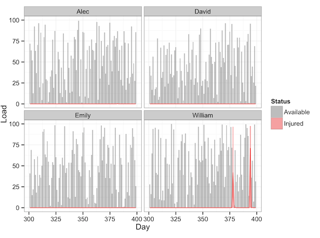
This is a worksheet I put together, based mainly off of ideas from Mladen’s ‘Athlete Monitoring’ worksheet, to provide an example of how Excel can be used to visualise load data in an informative way. We went through a couple of the techniques used in this worksheet, such as VLookups and PivotTables/Slicers, and I highlighted the ‘ExcelTricksforSports’ YouTube channel as the best place to learn these types of techniques.
4. RSNLive17_load-optimiser-(add-zero-days) + RSNLive17_load-planner
We finished the workshop by going through these two worksheets, which can be used to objectively plan and optimise future workloads.
An explanation of the load optimiser can be found on Adam Sullivan’s (@adam89sullivan) website: Optimizing training loads using solver in excel
An overview of the load planner/forecaster is available HERE
Discussion points
There was some good discussion on the topic of getting athlete ‘buy-in’ when collecting things like sRPE data. We agreed that unless the subjective data provided by athletes was honest and valid, the subsequent steps in the ‘data journey’ were meaningless. The key advice from the practitioners in the room was to ensure there’s a feedback loop whereby the athlete sees some outcome/action from the data they are providing, and to only collect subjective data that will actually be used.
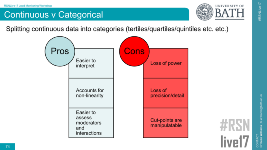
Another useful discussion was around the issue of splitting continuous data (e.g., the ACWR) into categories for analysis (e.g., <0.50 = very low, 0.50-1.00 = ‘low’, etc.):

Generally, it was agreed that splitting continuous data into categories is something to be avoided, as it results in a loss of power and precision. However, for non-linear effects such as the ‘U-shaped’ curve we see with ACWR, splitting the data into categories can help to report and explain such effects in comparison to modelling polynomials and suchlike when using continuous data. Clearly, there’s no right or wrong answer with issues like this, but the following points were raised (thanks in particular to Ken Quarrie for these)
- Start by determining whether there are no-linear effects in your continuous variable by including squared (and potentially cubed etc.) terms in your model (http://www.sportsci.org/resource/stats/polynomial.html). If there’s no evidence of non-linearity, then there’s probably no benefit in splitting your variable.
- If there is evidence for a non-linear effect, then splitting your variable may be helpful for explaining this relationship effectively and interacting it with other variables. Some important considerations are:
- Deciding how you split the continuous variable; tertiles, quartiles, quintiles, arbitrary ranges etc. Typically, I like to start with tertiles, as this is the minimal number required to observed a non-linear relationship, whilst helping to maintain power by having the same number of cases in each tertile. My concern with arbitrary splits for things like the ACWR (e.g., >2.50 = ‘very high’) is that there will be very few cases in the upper and lower categories, which may bias the results.
- The nature of the relationship between the predictor variable and outcome should be similar when analysing your split categorical variable as it was for the polynomial regression; if they tell different stories, then your method for splitting the data needs to be reconsidered.
- Clearly explaining the method and rationale for splitting variables within our research papers, and reporting the number of cases in each category, will help the reader to interpret the results.
We hope these resources will be useful for those involved in load monitoring data. Many thanks to all those that attended and contributed to this workshop.


Responses