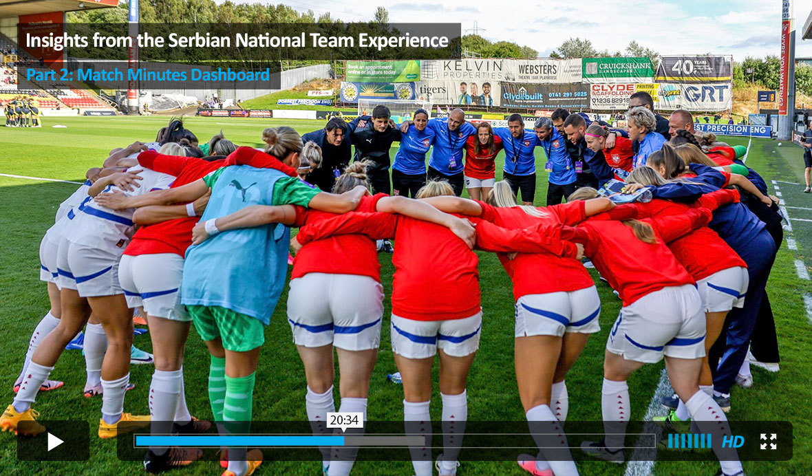
Insights from the Serbian National Team Experience Part 2: Match Minutes Dashboard
In the previous video, I have covered some major issues, experiences, and insights from my National Team experience so far. In this video, I will demonstrate the “Match Minutes Dashboard”, which we use to analyze the match loads athletes are facing before coming to the national team camp.
The Match Minutes Dashboard
When players arrive at a national team camp, you have around 10 days. Two matches. Limited training exposure. Not enough time to build anything substantial.
But enough time to make a mistake.
Some athletes come in after dense competition periods. Others haven’t played much at all. On paper, they’re all “available.” In reality, the match exposure behind that availability can look very different, and that shapes how we approach the camp from day one.
We built the Match Minutes Dashboard to make that difference visible.
The data itself is simple: minutes played with clubs, match dates, national team games included. Structured, organized, and visualized so trends are clear before the camp even starts.
To get perspective, we use rolling windows.
Acute exposure covers the last 14 days.
Chronic exposure looks at the last 42 days.
We track minutes per match, minutes per day, and how recent exposure compares to longer-term patterns. If the acute-to-chronic ratio moves above 100, it suggests the recent load is higher than what the athlete has been accustomed to. If both windows are trending down, that may indicate reduced match readiness.
Not as a verdict. As context.
In a 10-day window, we’re not trying to maximize adaptation. Sessions are intentionally risk-averse. The reality is simple: we cannot significantly improve players in that time, but we can disrupt what they already have.
This dashboard helps us avoid blind spots. It gives the selector and staff a clearer picture of what each athlete is bringing into camp, both individually and across the squad.
It’s still evolving. We adjust it, refine it, and tune it as we learn more. The aim isn’t to build an optimal monitoring system. The aim is to build one that is robust enough to support better decisions.
The full breakdown — including how the charts are structured, what we actually look for, and real examples from camp — is in the video below.


Responses