Spider Charts Sucks!
I am openly sharing my opinion (backed up with work by Stephen Few) that spider charts sucks. It is time for the sport scientists to move away from PES (Pro Evolution Soccer; game on Sony Playstation) and similar games influencing how we visualize athlete profiles.
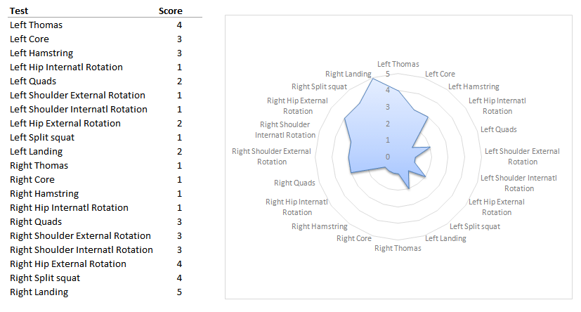
Let’s assume we have a movement screen scores and we want to visualize them to see asymmetries between limbs/sides. Just for the sake of an example take a look at this picture:

Even if I managed to sort the metrics (Left vs. Right) can you tell right off the bat where does the athlete has asymmetries?
This becomes even harder and confusing once we have more athletes and metrics.
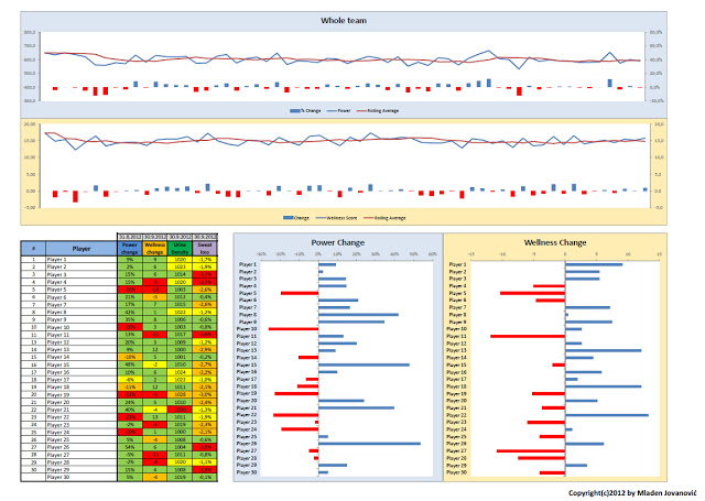
Now take a look at this picture. Simple bar graphs.

Can you quickly glance over the picture is see where the problems are? It is easy to sort the asymmetry chart regardless of the number of metrics/tests.
Please compare the two and let me know which one gives you more ‘story’. Any idea how to visualize these better let me know on the Forum.
Once again please ditch the Spider/Radar charts where they belong – to children’s Playstation games.


I completely agree. I’ve rarely encountered anyone using spider graphs outside of the gaming industry or among those focused more on visual impact than on presenting a factual analysis. In my opinion, bar charts are the most effective choice for a above mentioned data visualization, although area charts can also serve as a viable alternative in certain cases.