Playing With Statistics [Part 5]
Although at the end of part 4 I mentioned I will talk about analysis of frequent tests like sRPE, HRV and other’s that are used for monitoring, I will not do that in this part. Maybe in part 6 because I am still ‘playing~struggling’with that one. What I want to talk today is data visualization.
A friend of mine and a fellow coach Carl Valle (check the interview with him here) is big into data visualization. There is a lot to be said regarding this and I myself saw the BIG differences when I visualized the data the right way.
I remember in my high school when the professor of electronics said that in Power Plants they use analog dashboards versus digital, because humans respond and understand analog dashes more (“is it red?”) than digital (“is it above 36,785?”), besides it takes them less time to scan 20+ instruments in analog form, that in digital form. Imagine reading 20+ numbers or just watching 20+ analog indicators. And yes, they showed less decision making errors. At least according to my professor.
Digital dashboard
Analog dashboard
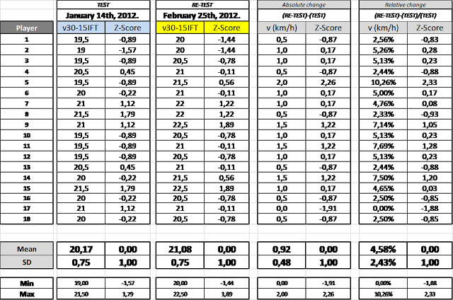
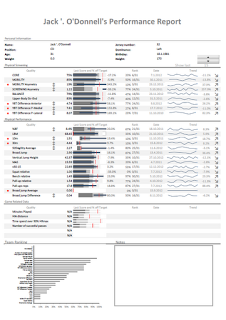
The point of this is that I printed the table with the scores and guess what? No one understood.
The players would say WFT?
Then, the scientist in me wanted to print them Z-score so the guys know where each of them stand regarding the team mean value.
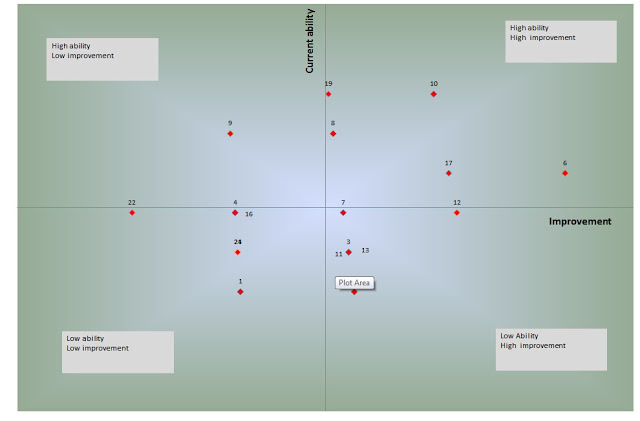
Or, even worse, I combined (in another test) z-score in test value with z-score in improvement so the guys can know their ranking within the group.
More players would say WTF and why am I below zero? Does that mean I bad?
Well, no one understood! Athletes are not scientists. Keep the Z-score and quadrant analysis for coaching staff and yourself. First of all, they don’t understand. Second, they want to see the improvement to be motivated. No one understand why their improvement is negative in Z-score. How do you think this is going to impact their motivation (“Mladen, why I am below zero in squat?”). To keep the long story short, if you want to present the data think about the observer and what does he takes out from the data.
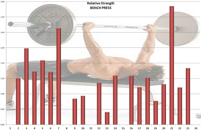
So, I decided to present the absolute scores (for example in relative bench press; please note that I had hard time explaining what is relative strength and how it is calculated as well, but less straining than explaining Z-score) both in level reached and improvement. Everybody is above zero, so it doesn’t screw with their motivation 🙂
Ahaaa…. now I understand – I am stronger that Athlete number 19…
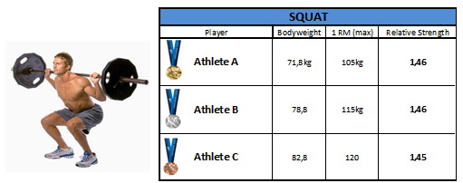
I have also created basic Medal Ceremony, where three best players are awarder with medals. On paper of course.
What I also learned in the last couple of days between writing these blog entries is how much data visualization can help coach to make better decisions. At the moment my professional interest is individualization of training in team settings using monitoring of workloads, training reactions and fatigue and adaptation of the athletes. So, I collected all the testing data in one Excel sheet and I wanted to create player evaluation based on the test scores and test improvement so I can make training decisions for each more easily.
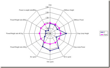
I decided to use spider graph to visualize the Z-score. Again, the Z-score tells me how much an athlete is away from the team average. What does this mean is that I can check (using the other monitoring data) whether the general training is enough for certain athlete (if I take his reaction to training into account). In other words it helps me individualize training (although in team setting that is really hard) and it helps head coach to see player characteristics more easily.
Here are the three players for an example.
You can see that the player have different qualities. What we can also do is to depict how did the player responded (improved) to a training program we did (again expressed in Z-score so we can compare it to the team average).
Please note that I showed only test with the re-test (4 re-test). What you can see on the right spider graph is that this athlete responded the most to endurance training and he was so-so in the strength improvement. What this can tell me is that he might need different strength training program. Maybe more. Maybe less if he is fatigued (this depends on the other indicators calculated by monitoring).
IMHO, spider graphs of both test score and test improvement, together with Quadrant Analysis™ and monitoring data can tell you a lot about an athlete. Of course, if the test you are using are valid, reliable and sensitive. This can be also tested, but it is beyond this article.
For the end here is the picture of the Quadrant Analysis™ I use used for 30-15IFT analysis of the players.
This is all for now folks. I will come back with some ideas how to analyze monitoring data based on individual variations and team variations. Stay tuned…









Responses