ClusteringPRO Instructional Walkthrough
Working in sport means living with messy data. You test athletes, you monitor them, you track wellness, readiness, and performance metrics. Soon you’re staring at dozens of numbers across multiple columns. The problem isn’t collecting the data. The problem is knowing what to do with it.
Are there natural groups in your squad? Which metrics are driving those groups? Are some variables redundant? Who represents the extremes in your dataset? These are practical questions that help you design training, adjust loads, and communicate insights to staff and athletes. ClusteringPRO was built to answer them.
This second instructional video shows how the app works in practice, from loading data to interpreting clusters, archetypes, and variable importance. I am also attaching the first, shorter overview video. Make sure to check that one out before proceeding with the second one (located at the end of the article).
Quick Overview
Data Preparation
Everything starts with data. You can upload your own CSV or use the built-in demo datasets. Each dataset has an ID column, or the app will use row numbers if none is provided. You can also mark annotation columns—categorical variables you want to use for labels and coloring plots.
Numeric values are normalized. Categorical variables are turned into dummy codes (0 and 1). To keep both on the same scale, the app divides by two standard deviations. This is based on Andrew Gelman’s recommendation for handling mixed data. It keeps things fair so one variable doesn’t dominate just because of its scale.
There is also an option to apply weights. If you believe a certain variable matters more, you can give it extra influence. The formula is straightforward: weight × ((x − mean) / SD). This keeps you in control of the analysis rather than letting the algorithm decide everything.
Checking the Data
Before clustering, the app checks for variables with zero variance. If every row has the same value, the variable is dropped. It carries no information and can interfere with distance calculations. This step makes sure only meaningful variables are included.
Hierarchical Clustering
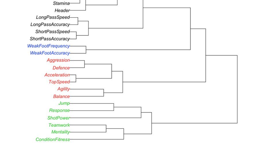
The first major tool is hierarchical clustering. Here you can choose a distance metric (like Euclidean or Manhattan) and a linkage method (Ward.D2 is often the default). The algorithm builds a tree that groups observations based on similarity.
You can then cut the tree into clusters. The visualization shows these groups on dendrograms and heatmaps. You also decide whether to color by the clusters themselves or by your annotation column. This flexibility helps you compare what the algorithm finds with what you already know about your group.
If you are unsure how many clusters to choose, you can run NbClust. This script tests multiple indices and shows how many clusters get the most “votes.” It doesn’t give you a single answer but a structured way to decide.
PCA
Principal Component Analysis (PCA) is the second major tool. PCA reduces complexity by finding new axes that capture the most variation. PC1 is the direction of maximum variance. PC2 is orthogonal to PC1 and captures the next largest chunk of variation.
This lets you plot data in two dimensions and still see most of the structure. PCA can reveal when variables are highly correlated, when redundancy exists, or when there are clear patterns of spread. It complements clustering by giving a different view of the same dataset.
Archetypal Analysis
Clustering shows you who belongs together. Archetypal analysis shows you where the extremes are. Archetypes are points on the edges of your dataset. Every observation is then expressed as a mix of these archetypes.
For example, someone might be 70% Archetype 1 and 30% Archetype 2. This is more nuanced than clustering, where each observation belongs to only one group. Archetypes give you a sense of “pure profiles” and how everyone blends between them.
The scree plot helps you decide how many archetypes to keep. You then explore loadings to see how each variable contributes to each archetype.
CART and Variable Importance
After clustering, you might ask: what explains these groups? CART (Classification and Regression Trees) builds simple if–then rules. For example, if strength < 150 then Cluster 1, otherwise Cluster 2. These rules are easy to interpret and communicate. Random Forest goes further by building many trees and ranking variables by importance. Unlike other modules, this step uses the original, unscaled data. It shows you which variables matter most for predicting clusters. That’s valuable when you want to identify key drivers instead of just seeing patterns.
Built-In Datasets
The built-in datasets are not just demos—they are teaching tools. Some have no clusters, others have obvious ones, and others form shapes like triangles or squares. These examples let you see how each method behaves before you apply it to your own data. They’re a safe way to learn by doing.
Why It Matters
Coaches and sport scientists don’t need abstract algorithms. They need tools that help them answer real questions.
- Who belongs in which group?
- What variables are redundant?
- Where are the extremes?
- Which metrics actually matter?
ClusteringPRO gives you a way to explore these questions. You can play with data, adjust parameters, and see how the structure shifts. It turns raw numbers into something you can work with in practice.
Instructional Video
ClusteringPRO is free for all our members! If you’re not part of the Complementary Training community yet, now’s the perfect time to join and start exploring your data with purpose.


Responses