Player Monitoring – Team Dashboard
I have been working lately on summarizing the data we collected and creating one dashboard in Excel (I am going to start using R, because I think I will be able to do more powerful data analysis and visualization and it is free).
I use this sheet to store, analyze and visualize the data we collect (Power in vertical jump using GymAware (Big THANKS to Rob Shugg), Wellness questionnaire (Big THANKS to Stuart Cormack), urine density (Big THANKS to Dan Baker) and pre-post body-weight) for the sake of identifying ‘outliers’ in recovery and being able to individualize training even more. The data can be easily expanded to HRV, tapping frequency, grip strength you name it. But honestly, doing this in Excel is real pain in the arse.
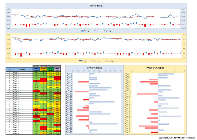
On the following picture is the team dashboard (each player has his own dashboard too, and it is same as the top two graphs). All the data are random.

On the top of the page there are two graphs. Blue one is for power measurement. Orange one is for wellness measurement (questionnaire data). Each of them have two parts – the line part shows the raw data (average team power) along with rolling average over last 6 measurements. This allows us to see the trends overall across the months. Next one is “deviation relationship” (bar charts) that show how much current power measurement deviates from the rolling average. This graph has power to show us ‘fatigue’ – if the power is higher than average then it is blue. If the power is decreased compared to average the graph is red. Same thing for wellness data – if someone scores higher than usually then it is blue (he is fine) – if he scores lower than usual he is red (he might be tired – need checking – that’s why it is important to track trends as well). Again, this is for the whole team on average – the power of this is that we track each player and we have this data for each player as well.
On the bottom are the last scores in the table with light system (everything have light system) which includes power and wellness deviation and latest measured urine density and sweat loss. This is also depicted visually for each player. This allows us to identify outliers (the guys who are tired).
Unfortunately I cannot share much more information about monitoring we do, but all interested individuals and teams can contact me on my email and I would be more than glad to provide assistance/consultation on how to create simple monitoring system (using only questionnaire for example) and how to analyze and visualize the data.


Responses