How to Make a Readiness Monitoring Using a Simple Wellness Questionnaire [Part 3]
Click here to read the first part of the article »
Click here to read the second part of the article »
Although I promised I will show you how to visualize the data using screen cast – I won’t do it. I started taping the screen and it took me more than one hour to actually explain basics, without going into advanced techniques, like name references, dynamic graphs anddash boarding (which involves a lot of use of functions like VLOOKUP, HLOOKUP, INDEX and MATCH).
Editing would take even longer, since I am not so comfortable with these advanced techniques yet and I would need to reference help files or websites for formulas, parameters, etc, and that would need to be cut from the video, or you would just need to endure my Directors cut version 🙂
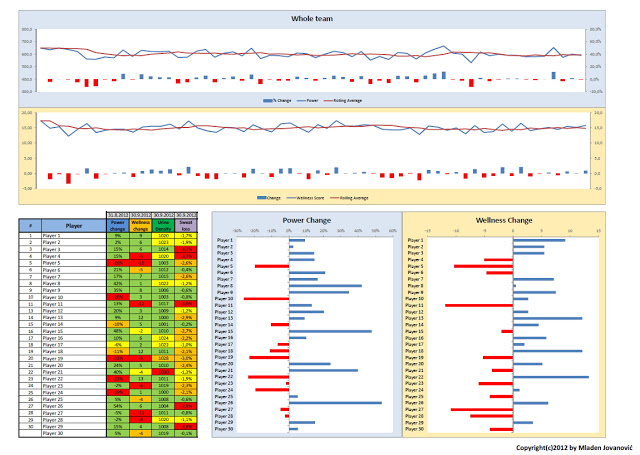
What I did instead, is I created a template which Complementary Training members can download at the bottom. Here is the screen of the dashboard.

I’ve left more than 150 empty spaces for you to fill with your own data, and I have provided 5 example surveys just to show you the how the visualizations and dashboard works.
To create visualizations of the data, I’ve used Excel 2010 sparkline function, that shows 10 last measurements for each player or whatever you decide in the “Show last” box (that’s the power of dynamic graph).
The problems with sparklines is that there is no absolute zero (and no axes), but rather it depicts range between two end-points, so a small change end up looking huge. That’s why it is important to check numbers as well.
If you are interested in these topics you can check the following sources that will help you out:


Responses