Exploratory In-Situ Analysis of the GPS and HR Football Match Data
In this article I will explore a few in-situ (or embedded) analyses of the GPS and heart-rate (HR) data collected using the Polar Team system over a single football match. I recently joined Serbian National Women Football team, so this data comes from one international match. I will provide the R code, and the members will be able to download the dataset (polar-team.RData) at the end of this article.
Dataset polar-team.RData is cleaned Polar Team data (i.e., raw data) involving 10Hz samples of the velocity, acceleration, HR, as well as power (which is a combination of acceleration and velocity; with the aim to estimate metabolic power) for 7 athletes who player full 90 minutes.
Show/Hide Code
library(tidyverse)
library(ggdist)
library(plotly)
library(zoo)
library(kableExtra)

load("polar-team.RData")

polar_df %>%
  filter(Time > 100) %>%
  group_by(Athlete) %>%
  slice(1) %>%
  ungroup() %>%
  head() %>%
  kbl("html", escape = FALSE, digits = 2) %>%
  kable_paper(full_width = F, lightable_options = "hover")
| Athlete | Clock | Time | HR | Velocity | Acceleration | Power |
|---|---|---|---|---|---|---|
| Athlete A | 14:31:40.1 | 100 | 157 | 0.92 | -0.07 | 80 |
| Athlete B | 14:31:40.1 | 100 | 179 | 0.98 | -0.12 | 119 |
| Athlete C | 14:31:40.1 | 100 | 0.00 | 0.00 | 0 | |
| Athlete D | 14:31:40.1 | 100 | 173 | 1.57 | -0.05 | 139 |
| Athlete E | 14:31:40.1 | 100 | 158 | 1.32 | -1.68 | 54 |
| Athlete F | 14:31:40.1 | 100 | 164 | 2.01 | 0.58 | 345 |
Velocity and Heart Rate
Figure below depicts raw velocity (in \(ms^{-1}\)) across two halves together with the hear rate (HR) expressed in beats-per-minute (bpm).
Show/Hide Code
coef <- max(polar_df$HR, na.rm = TRUE) / max(polar_df$Velocity, na.rm = TRUE)

polar_df %>%
  ggplot(aes(x = Time, y = Velocity)) +
  geom_line(aes(color = "Velocity (m/s)"), alpha = 0.3) +
  geom_line(aes(y = HR / coef, color = "Heart Rate (bpm)")) +
  scale_y_continuous(sec.axis = sec_axis(~.*coef, name = "Heart Rate (bpm)")) +
  facet_wrap(~Athlete) +
  labs(x = "Time (sec)", y = "Velocity (m/s)", color = "") +
  scale_color_manual(values = c(color_red, color_grey))
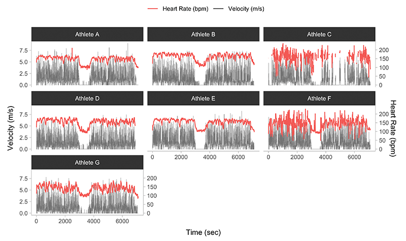
Please note that two athletes showed higher variability in the HR. This might be due to the sensor moving. Let us zoom more closely into two athletes over a first half, one of which has low variability in HR and one which has high variability in HR:
Show/Hide Code
polar_df %>%
  filter(Athlete %in% c("Athlete D", "Athlete F")) %>%
  filter(Time < 3000) %>%
  ggplot(aes(x = Time, y = Velocity)) +
  geom_line(aes(color = "Velocity (m/s)"), alpha = 0.3) +
  geom_line(aes(y = HR / coef, color = "Heart Rate (bpm)")) +
  scale_y_continuous(sec.axis = sec_axis(~.*coef, name = "Heart Rate (bpm)")) +
  facet_wrap(~Athlete) +
  labs(x = "Time (sec)", y = "Velocity (m/s)", color = "") +
  scale_color_manual(values = c(color_red, color_grey))
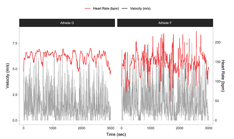
We can notice the breaks in the signal. Will not go much in the diagnostics here, but I am pretty certain this is some type fluke.
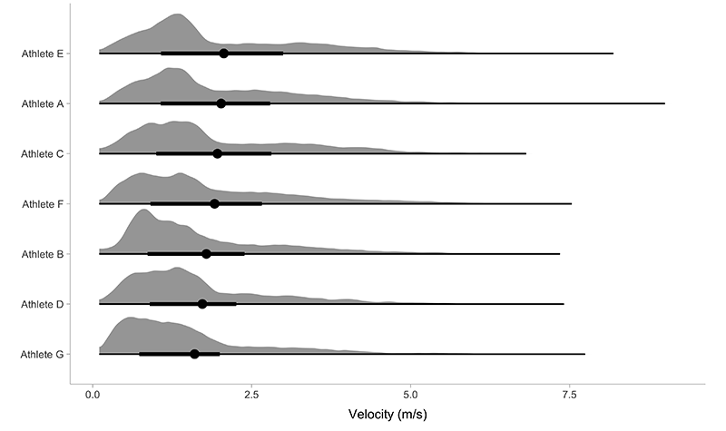
The next graph depicts simple distribution of the velocities across two halves:
Show/Hide Code
polar_df %>%
  filter(Velocity > 0.1) %>%
  mutate(Name = reorder(Athlete, Velocity, FUN = function(x){mean(x, na.rm = TRUE)})) %>%
  ggplot(aes(y = Name, x = Velocity)) +
  ggdist::stat_slabinterval(
    expand = FALSE,
    trim = FALSE,
    .width = c(0.5, 1),
    normalize = "all",
    scale = 0.9,
    point_interval = "mean_qi") +
  ylab(NULL) +
  xlab("Velocity (m/s)")
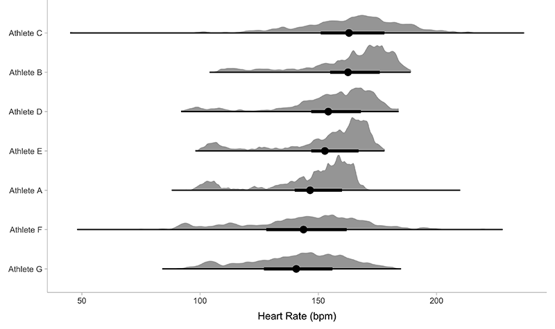
The next graph depicts the distribution of the HR:
Show/Hide Code
polar_df %>%
  na.omit() %>%
  mutate(Name = reorder(Athlete, HR, FUN = function(x){mean(x, na.rm = TRUE)})) %>%
  ggplot(aes(y = Name, x = HR)) +
  ggdist::stat_slabinterval(
    expand = TRUE,
    trim = FALSE,
    .width = c(0.5, 1),
    normalize = "all",
    scale = 0.9,
    point_interval = "mean_qi") +
  ylab(NULL) +
  xlab("Heart Rate (bpm)")
Game pace
The velocity trace is pretty volatile, so we can aim to smooth it out, by doing rolling-average (I will use slightly different mean function using squared values to give more weight to the higher velocities due to intermittent nature of the sport). This can give us some idea of the game pace. To do so, we will calculate the 5-min rolling average (for which the estimates are centered using 2.5-seconds preceding and 2.5-second following a give time instant). Since the Polar GPS samples at 10Hz, for 5-minute, we need a rolling 3,000 samples (i.e., \(5 \cdot 60 \cdot 10\)). This is depicted as a black line on the next figure.
Show/Hide Code
roll_mean <- function(x, width, align = "right") {
  zoo::rollapply(
      data = x,
      width = width,
      fill = NA,
      align = align,
      FUN = function(x) {
        sqrt(mean(x^2, na.rm = TRUE))
      })
}

polar_df <- polar_df %>%
  group_by(Athlete) %>%
  mutate(
    Velocity_5min = roll_mean(Velocity, 300 * 10, "center")
  ) %>%
  ungroup()

polar_df %>%
  ggplot(aes(x = Time)) +
  geom_line(aes(y = Velocity, color = "Velocity (m/s)"), alpha = 0.1) +
  geom_line(aes(y = Velocity_5min, color = "Velocity 5min roll(m/s)"), alpha = 0.8) +
  facet_wrap(~Athlete) +
  labs(x = "Time (sec)", y = "Velocity (m/s)", color = "") +
  scale_color_manual(values = c(color_grey, color_black))
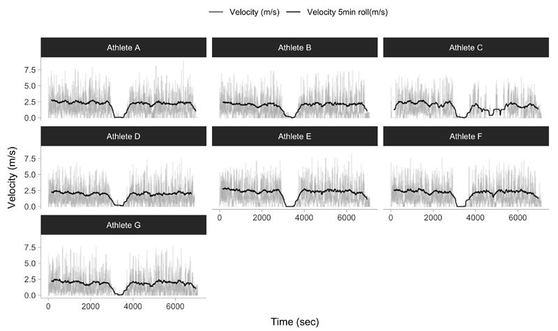
Here is exactly the same rolling 5-min trace for a single athlete, to provide certain zoom-in.


Responses