R Playbook: Introduction to Multilevel/Hierarchical Models
I wrote about mixed-level models before and I want to expand on it here. I sort-of finished Andrew Gelman’s Data Analysis Using Regression and Multilevel/Hierarchical Models and will continue to play with it. As far as I know Andrew uses the term multilevel models and avoids the terms fixed and random effect. This is a great book to have.
My next step in the next couple of months is to learn Bayesian Data Analysis since it is used with Multilevel/Hierarchical models.
Anyway, for this playbook I will continue to use sleepstudy dataset from lme4 package (which is used for fitting multilevel models). Sleepstudy is longitudinal study (n=18) over 10 days of sleep deprivation effects on reaction time.
library("lme4")
library("ggplot2")
library("googleVis")
library("stargazer")
library("sjPlot")

sleepstudy <- sleepstudy
As with the previous example we can show the “pooled” scatterplot where on x-axis are days and on y-axis is reaction time. Each dot is one individual’s reaction time (including repeated measures)
# "Pooled" (days ~ reaction, without groups) scatterplot and linear model
gg <- ggplot(sleepstudy, aes(x = Days, y = Reaction)) +
    geom_smooth(method = "lm", se = FALSE) +
    geom_point(alpha = 0.3, size = 3) +
    theme_bw() +
    scale_x_continuous(breaks = 0:9)

print(gg)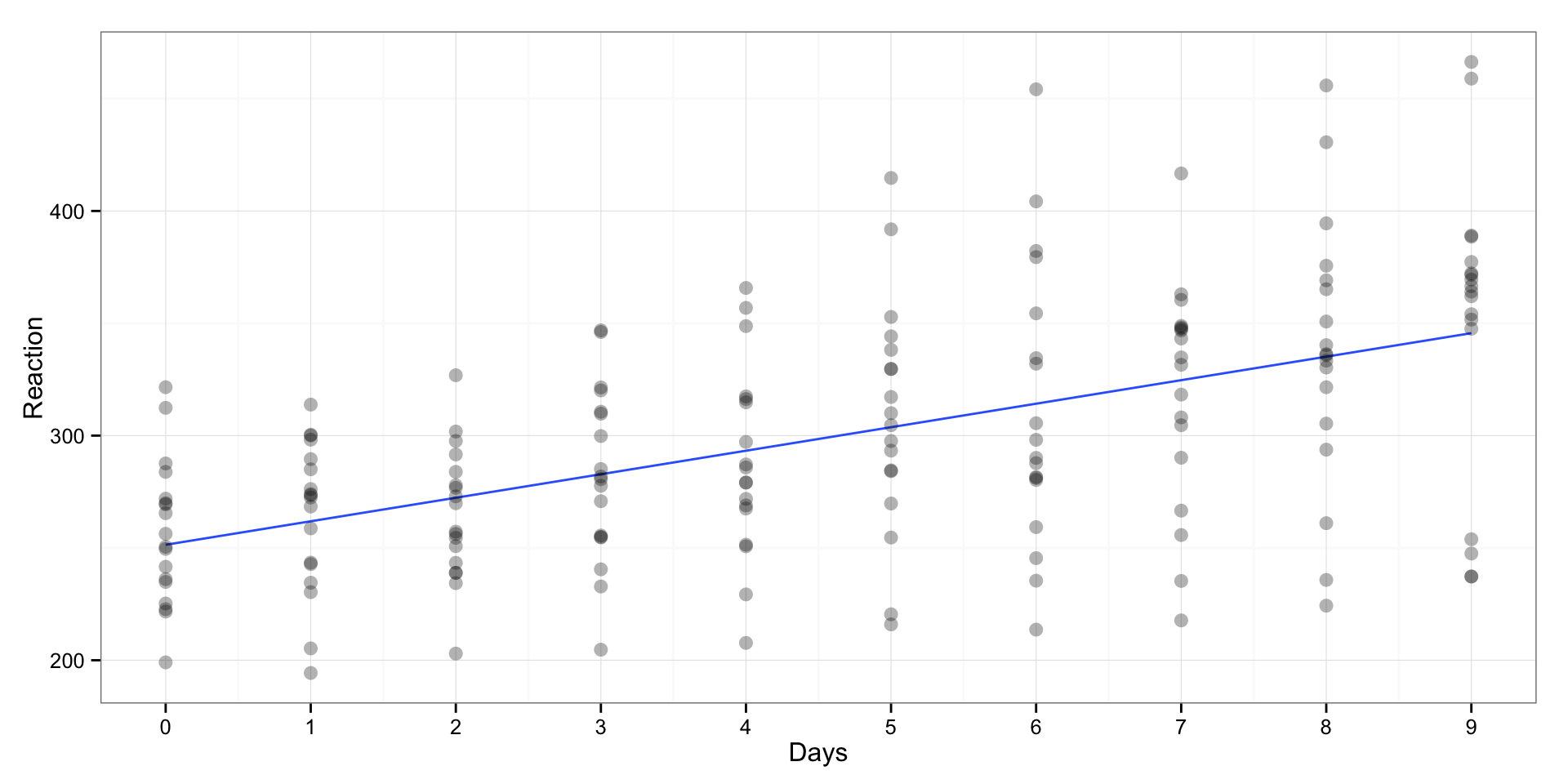
We can fit linear regression model over “pooled” data to get effect of days of sleep deprivation on reaction time
# Create pooled linear model and predictions
pooled.model <- lm(Reaction ~ Days, sleepstudy)

# Save the fitted values
sleepstudy$PooledPredictions <- fitted(pooled.model)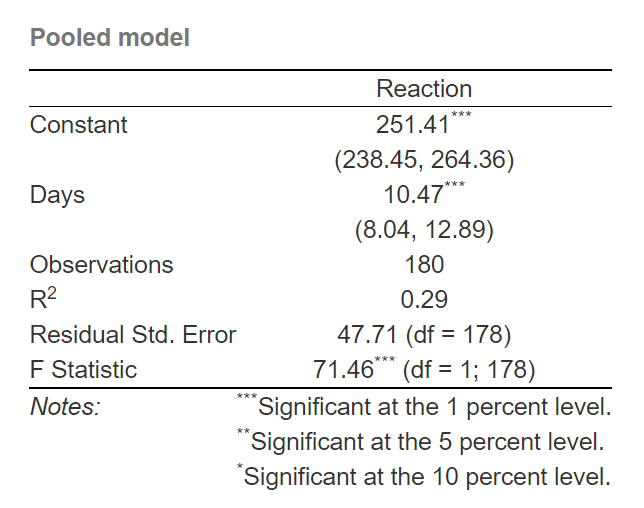
As can be seen, the (average) effect of days on reaction time is 10.47, which can be interpreted that for every day of sleep deprivation there is increase in reaction time for 10.47 ms.
Unfortunatelly, this is not a great model since it can predict only 28% of variances (R squared). Let’s plot the residuals (y-axis) versus fitted values (x-axis)
gg <- qplot(x = fitted(pooled.model), y = resid(pooled.model)) +
    geom_smooth(method = "lm", se = FALSE) +
    geom_point(alpha = 0.3, size = 3) +
    theme_bw()

print(gg)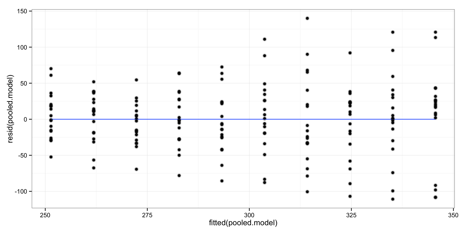
As can be seen there seems to be this “fan” shape of the residuals, or in statistical language: heteroscedasticity. In plain english it means that the variance (variability) around regression line is not equal on every part of the line – it becomes bigger as we move to the right.
This means that we need to log transform the target/outcome variable. This will make the effects multiplicative rather than additive.
# Create pooled linear model and predictions
log.pooled.model <- lm(log(Reaction) ~ Days, sleepstudy)

# Save the fitted values
sleepstudy$LogPooledPredictions <- exp(fitted(log.pooled.model))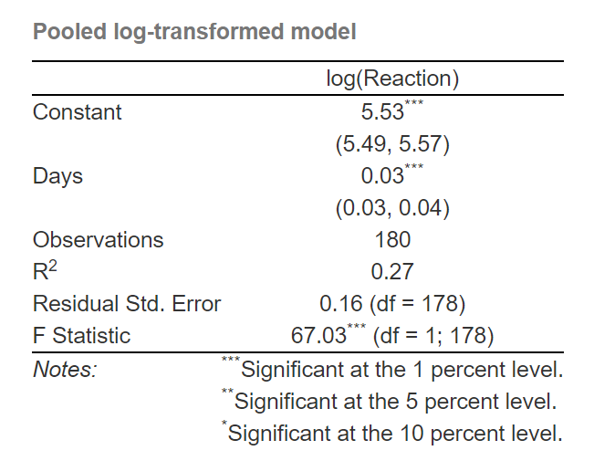
We got slightly lower R square (27%), but we should have fixed the heteroscedasticity. Let’s plot the residuals:
gg <- qplot(x = fitted(log.pooled.model), y = resid(log.pooled.model)) +
    geom_smooth(method = "lm", se = FALSE) +
    geom_point(alpha = 0.3, size = 3) +
    theme_bw()

print(gg)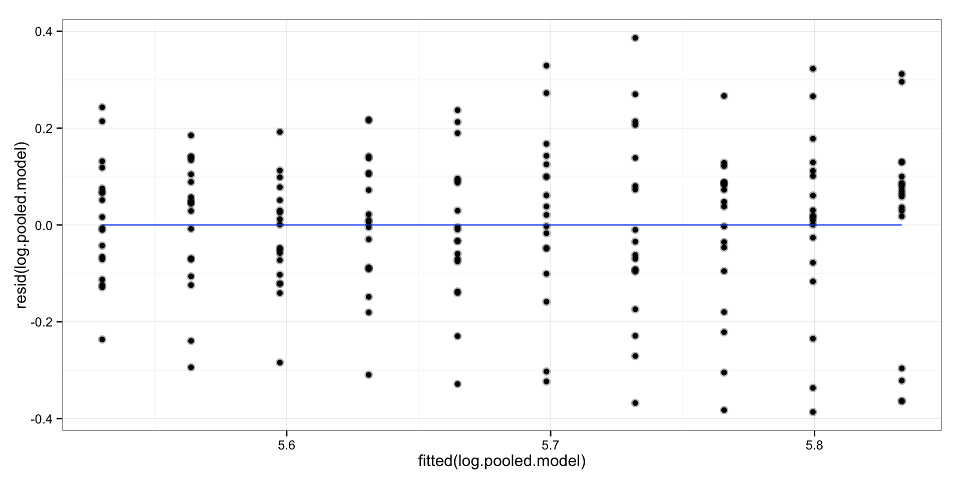
Not really as far as I can tell. What we now got with log transformation is that (when we un-log using exponential) for every day of sleep deprivation our reaction times increase for 3.42%. We get this when we take the exponent of the slope.
If we plot the log transformed model we will get slightly different fit (regression line):
gg <- ggplot(sleepstudy, aes(x = Days, y = Reaction)) +
    geom_smooth(method = "lm", se = FALSE) +
    geom_line(aes(y = LogPooledPredictions), color = "red") +
    geom_point(alpha = 0.3, size = 3) +
    theme_bw()

print(gg)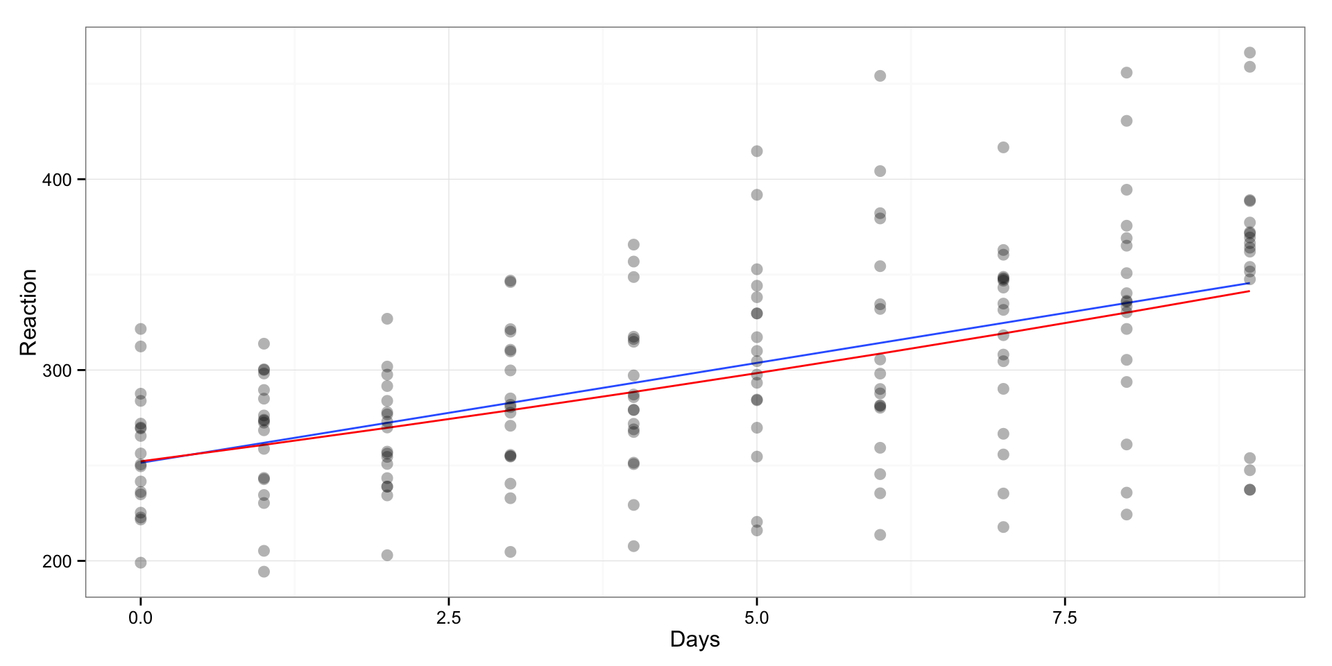
The blue line is linear regression line and the red line is log-transformed regression line.
Both of our pooled models are not very good at explaining variance. Probably because there is big between-individual variability in sleep deprivation effects. Let’s plot it:
gg <- ggplot(sleepstudy, aes(x = Days, y = Reaction, group = Subject)) +
    geom_smooth(method = "lm", se = FALSE, color = "darkgrey") +
    theme_bw()

print(gg)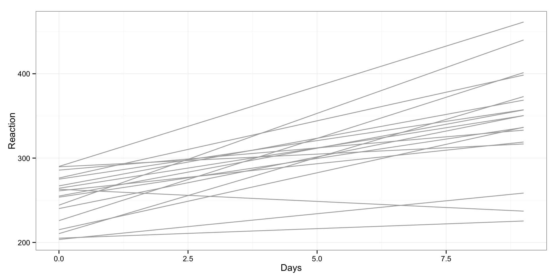
As can be seen there are different reactions to sleep deprivation between subjects. This is not the best graph to plot is, so I will use “trellis” plot, where we are going to create scatterplot for every subject:
gg <- ggplot(sleepstudy, aes(x = Days, y = Reaction, group = Subject)) +
    geom_smooth(method = "lm", se = FALSE, color = "darkgrey") +
    geom_point(alpha = 0.3, size = 3) +
    facet_wrap(~Subject) +
    theme_bw()

print(gg)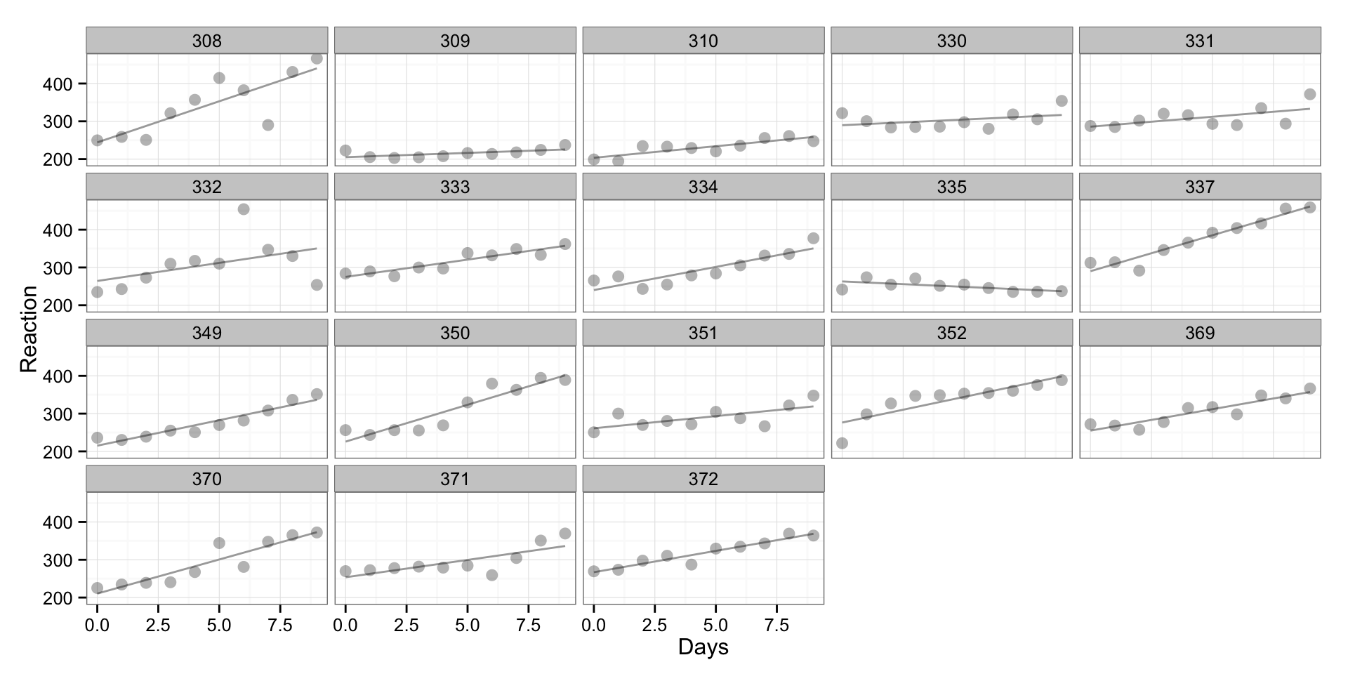
What can be seen is that there are different reactions of subjects during the sleep deprivation. What we did here is “un-pooled” model where we have fit the regression model for every individual (without taking into consideration other individuals).
What we can do is to use interaction between subject and days. Or in plain English, let’s fit regression line whose slope and intercept depends on the subject.
We can do this in three ways – only the intercept can vary (not real interaction though), only the slope can vary and both intercept and slope can vary (the real interaction model).
I will fit and plot all thress and compare it to the “pooled” regression line for easier comprehension.
# Fit the varying intercept model
varying.intercept.model <- lm(Reaction ~ Days + Subject, sleepstudy)
# Save the fitted values
sleepstudy$VaryingInterceptPredictions <- fitted(varying.intercept.model)

# Fit the varying slope model
varying.slope.model <- lm(Reaction ~ Days:Subject, sleepstudy)
# Save the fitted values
sleepstudy$VaryingSlopePredictions <- fitted(varying.slope.model)

# Fit the varying slope and intercept model
interaction.model <- lm(Reaction ~ Days + Subject + Days:Subject, sleepstudy)
# Save the fitted values
sleepstudy$InteractionPredictions <- fitted(interaction.model)
On the following graph we can see “pooled” regression line (grey line) and as you can see it is SAME for every individual, and we can see varying intercept (blue) line that is parallel to “pooled” regression line (same slope)
gg <- ggplot(sleepstudy, aes(x = Days, y = Reaction, group = Subject)) +
    geom_line(aes(y = PooledPredictions), color = "darkgrey") +
    geom_line(aes(y = VaryingInterceptPredictions), color = "blue") +
    #geom_line(aes(y = VaryingSlopePredictions), color = "red") +
    #geom_line(aes(y = InteractionPredictions), color = "black") +
    geom_point(alpha = 0.3, size = 3) +
    facet_wrap(~Subject) +
    theme_bw()

print(gg)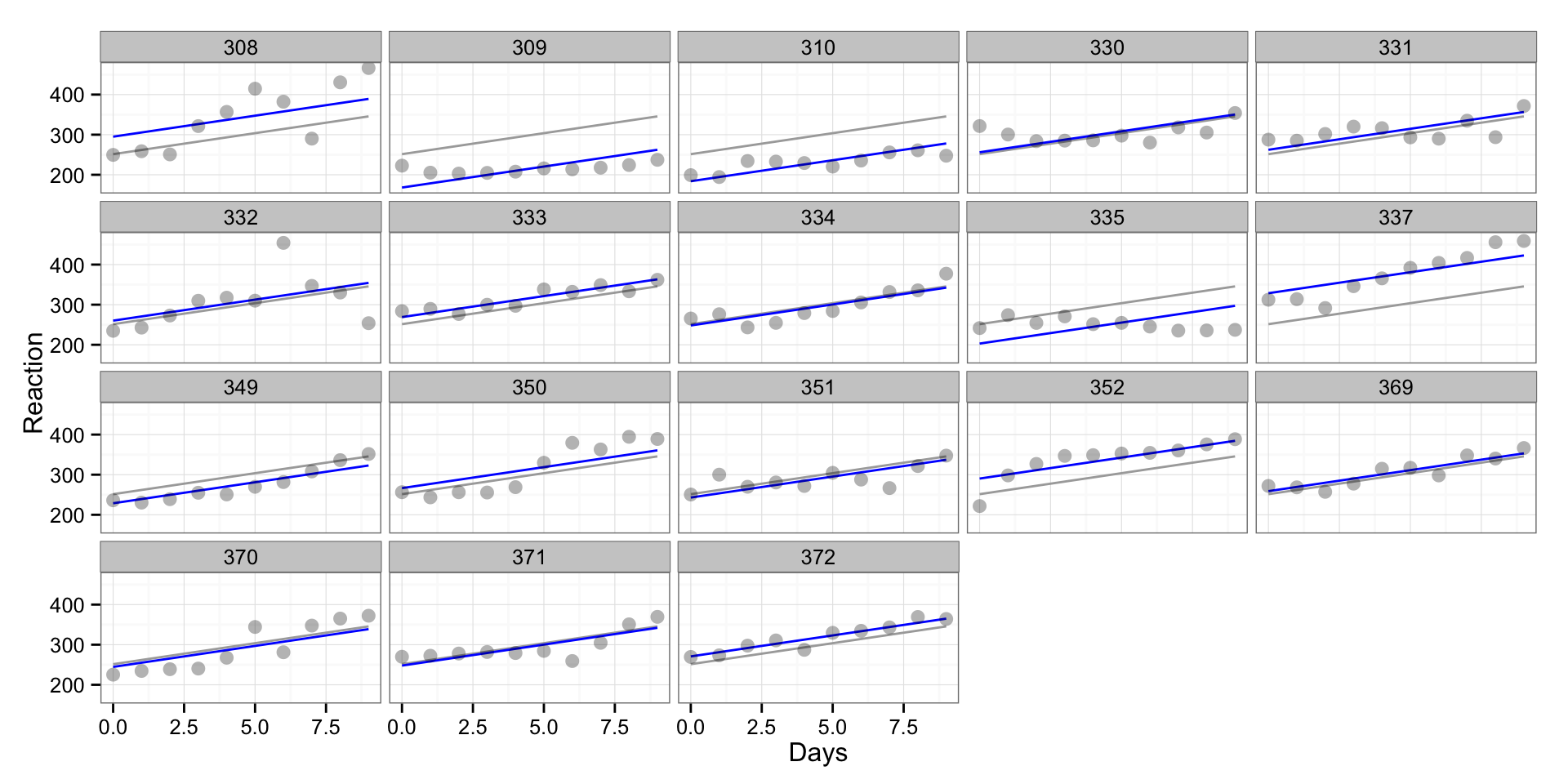
On the next picture we can see again “pooled” regression line and varying slope line (red). In this case the origin will be the same (same intercept) and only the slope will vary between individuals.
gg <- ggplot(sleepstudy, aes(x = Days, y = Reaction, group = Subject)) +
    geom_line(aes(y = PooledPredictions), color = "darkgrey") +
    #geom_line(aes(y = VaryingInterceptPredictions), color = "blue") +
    geom_line(aes(y = VaryingSlopePredictions), color = "red") +
    #geom_line(aes(y = InteractionPredictions), color = "black") +
    geom_point(alpha = 0.3, size = 3) +
    facet_wrap(~Subject) +
    theme_bw()

print(gg)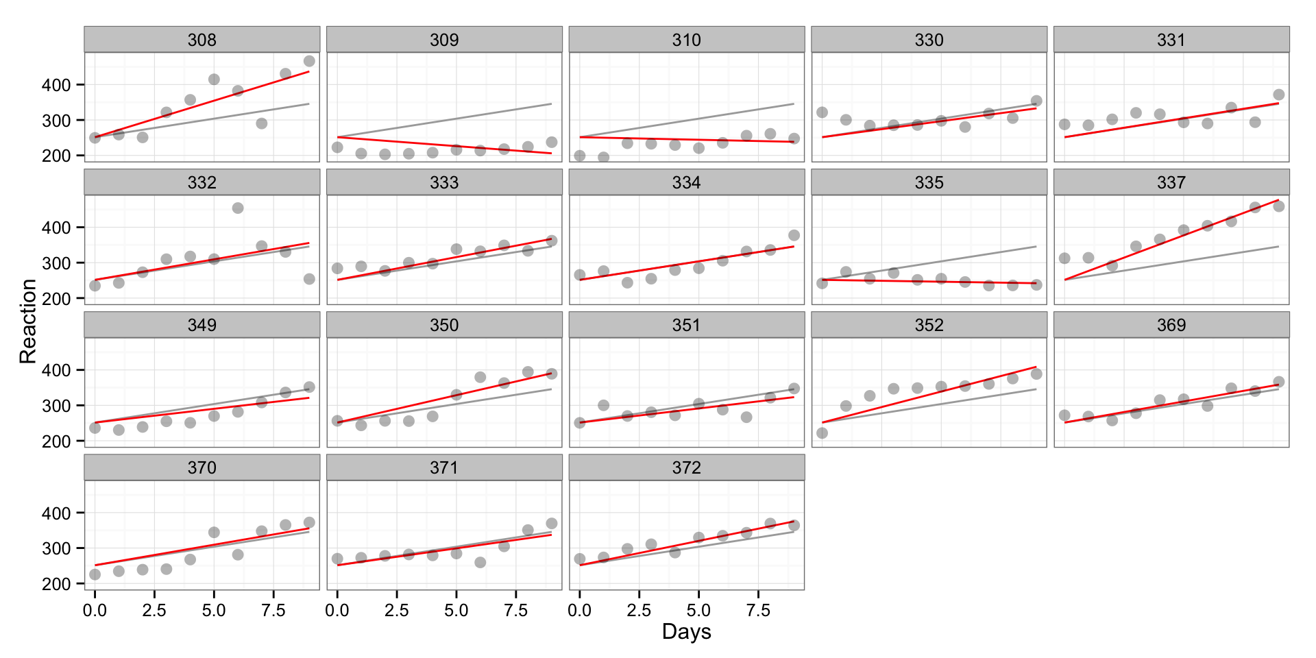
And finally a model with both intercept and slope varying between individuals (black line). This is true interaction model. This model predictions would be the SAME as when we fitted linear regression line for every individual as a subset. The only thing that would be different would be confidence intervals because we are going to have more degrees of freedom compared to “subset” model (this is not shown on graph, but it can be calculated using “predict(model, interval = ‘confidence’)”).
gg <- ggplot(sleepstudy, aes(x = Days, y = Reaction, group = Subject)) +
    geom_line(aes(y = PooledPredictions), color = "darkgrey") +
    #geom_line(aes(y = VaryingInterceptPredictions), color = "blue") +
    #geom_line(aes(y = VaryingSlopePredictions), color = "red") +
    geom_line(aes(y = InteractionPredictions), color = "black") +
    geom_point(alpha = 0.3, size = 3) +
    facet_wrap(~Subject) +
    theme_bw()

print(gg)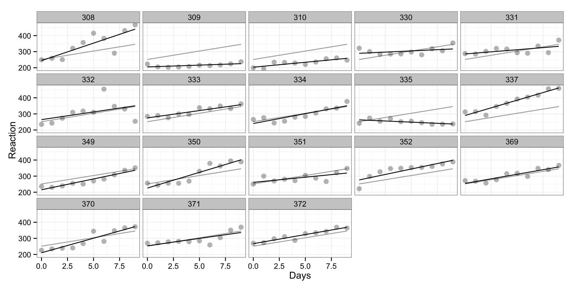
Now you probably understand the difference between “pooled” and “un-pooled” models, along with varying-intercept, varying-slope and varying-intercept-and-slope models. Ploting data helps a lot in understanding.
Anyway, what are multilevel models then? In short, there are something in-between “pooled” and “un-pooled” models. In this case the subjects are levels (or random variable).
As with above interactions, multilevel models can be varying-intercept, varying-slope and varying-intercept-and-slope models. They are interesting since they take both “pooled” model (fixed effects) and “un-pooled model” (random effects) into consideration, and as you will see on the picture below, the multilevel regression line will fall between “pooled” and “unpooled” regression.
Let’s fit one model with varying-intercept and varying-slope. On the graph the grey line rpresent “pooled” model (same across subject/levels), black represents “un-pooled” model (vary for every subject/level) and red line represents multilevel model.
ml.model <- lmer(Reaction ~ Days + (1 + Days | Subject), sleepstudy)
# Save the fitted values
sleepstudy$MLPredictions <- fitted(ml.model)

gg <- ggplot(sleepstudy, aes(x = Days, y = Reaction, group = Subject)) +
    geom_line(aes(y = PooledPredictions), color = "darkgrey") +
    geom_line(aes(y = MLPredictions), color = "red") +
    geom_line(aes(y = InteractionPredictions), color = "black") +
    geom_point(alpha = 0.3, size = 3) +
    facet_wrap(~Subject) +
    theme_bw()

print(gg)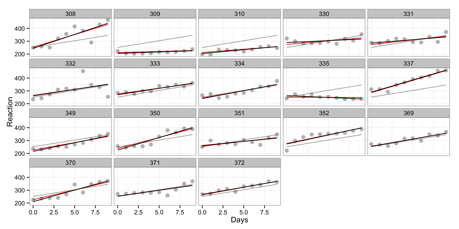
These are the summary and effects:
summary(ml.model)## Linear mixed model fit by REML ['lmerMod']
## Formula: Reaction ~ Days + (1 + Days | Subject)
## Data: sleepstudy
##
## REML criterion at convergence: 1743.6
##
## Scaled residuals:
## Min 1Q Median 3Q Max
## -3.9536 -0.4634 0.0231 0.4634 5.1793
##
## Random effects:
## Groups Name Variance Std.Dev. Corr
## Subject (Intercept) 612.09 24.740
## Days 35.07 5.922 0.07
## Residual 654.94 25.592
## Number of obs: 180, groups: Subject, 18
##
## Fixed effects:
## Estimate Std. Error t value
## (Intercept) 251.405 6.825 36.84
## Days 10.467 1.546 6.77
##
## Correlation of Fixed Effects:
## (Intr)
## Days -0.138fixef(ml.model)## (Intercept) Days
## 251.40510 10.46729ranef(ml.model)## $Subject
## (Intercept) Days
## 308 2.2585637 9.1989722
## 309 -40.3985802 -8.6197026
## 310 -38.9602496 -5.4488792
## 330 23.6905025 -4.8143320
## 331 22.2602062 -3.0698952
## 332 9.0395271 -0.2721709
## 333 16.8404333 -0.2236248
## 334 -7.2325803 1.0745763
## 335 -0.3336936 -10.7521594
## 337 34.8903534 8.6282835
## 349 -25.2101138 1.1734148
## 350 -13.0699598 6.6142055
## 351 4.5778364 -3.0152574
## 352 20.8635944 3.5360130
## 369 3.2754532 0.8722166
## 370 -25.6128737 4.8224653
## 371 0.8070401 -0.9881551
## 372 12.3145406 1.2840295Here is the plot of the random effects effects (as differnces from fixed effects)
gg <- sjp.lmer(ml.model, sort.coef = "Days", free.scale = FALSE)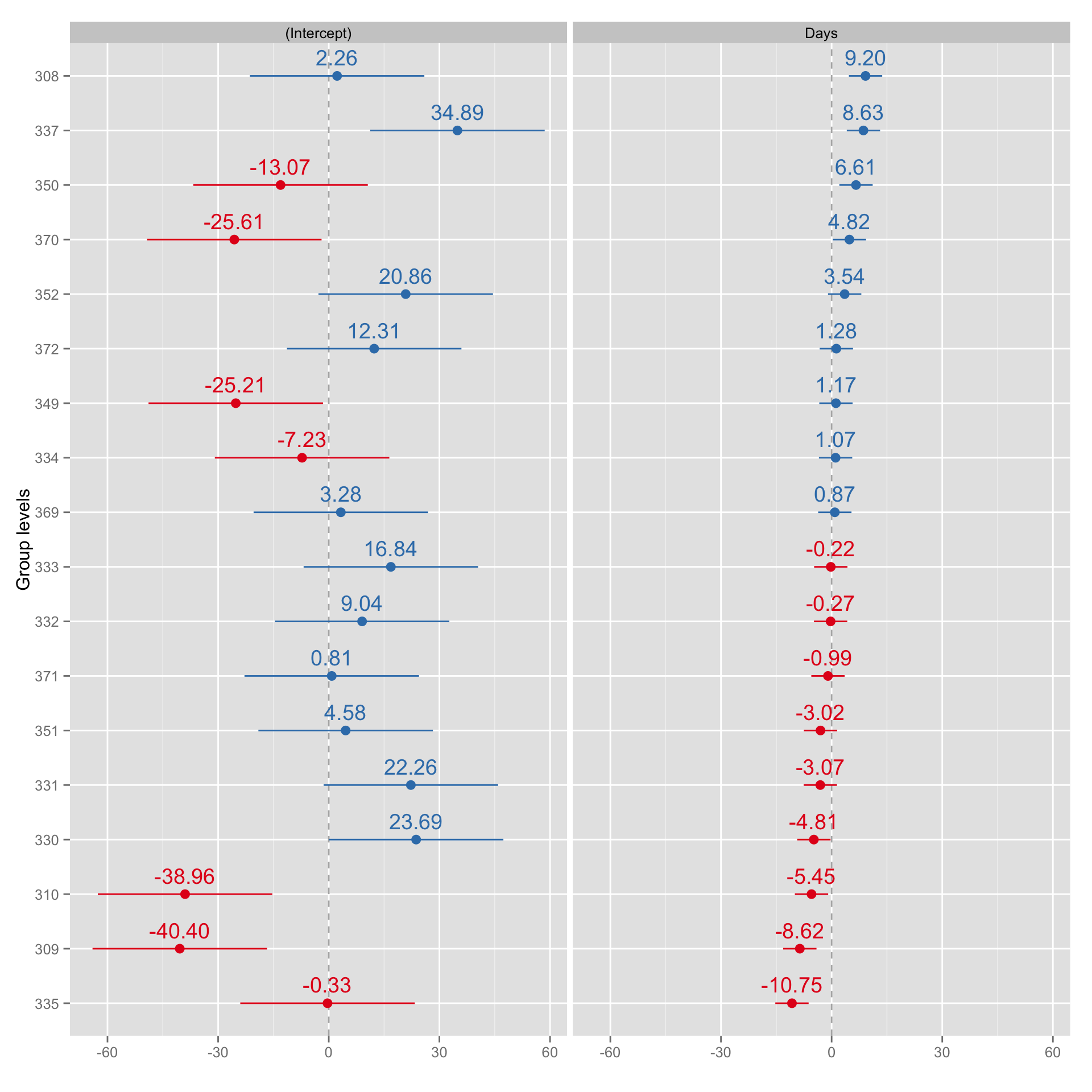
Why is this useful compared to interaction model? To be honest I don’t know (yet). My hint would be because it can take “pool” data as priors (Bayesian style) and can deal with missing values. The levels where we have less information (e.g. some days missing) will have multi-level regression line closer to the “pooled” regression line, since that would be our best estimate. This is the area I am still reading about and will know more about soon.
Let’s plot the data when we erase couple of days worth of data from one subject and see how it affects his predictions and model. Let’s choose subject 335 since he is very different that “pooled” model.
sleepstudy.missing.data <- sleepstudy[-c(82:89),]

# Create pooled linear model and predictions
missing.data.pooled.model <- lm(Reaction ~ Days, sleepstudy.missing.data)

# Save the fitted values
sleepstudy.missing.data$PooledPredictions <- fitted(missing.data.pooled.model)

ml.model.missing.data <- lmer(Reaction ~ Days + (1 + Days | Subject),
                              sleepstudy.missing.data)
# Save the fitted values
sleepstudy.missing.data$MLPredictions <- fitted(ml.model.missing.data)

gg <- ggplot(sleepstudy.missing.data, aes(x = Days, y = Reaction, group = Subject)) +
    geom_line(aes(y = PooledPredictions), color = "darkgrey") +
    geom_line(aes(y = MLPredictions), color = "red") +
    geom_smooth(method ="lm", se = FALSE, color = "black") +
    geom_point(alpha = 0.3, size = 3) +
    facet_wrap(~Subject) +
    theme_bw()

print(gg)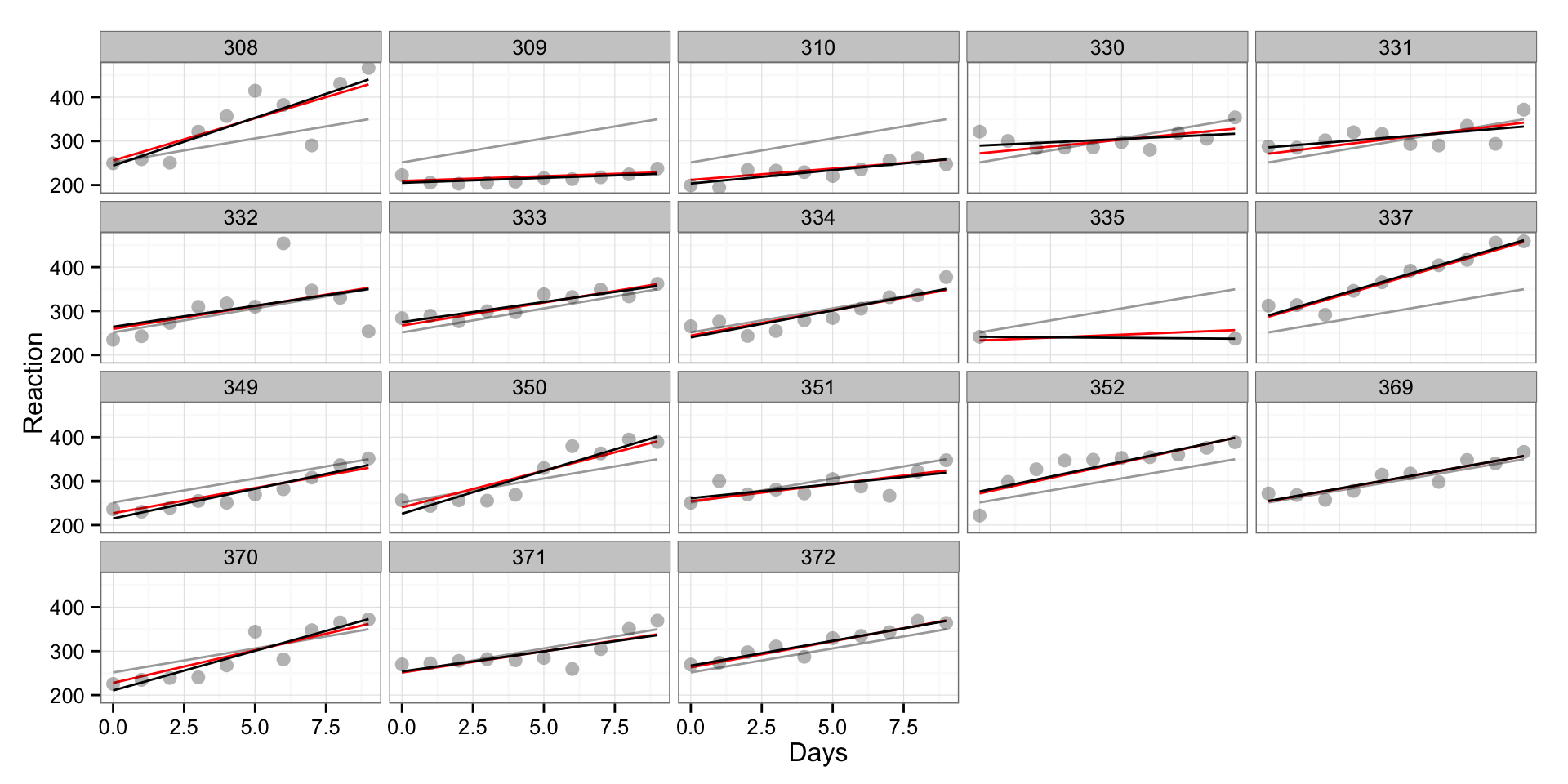
As can be seen, the red line is more “pulled-up” toward “pooled” regression line in the subject 335, since because lack of data model uses “pooled” estimates to give us the most informative fit (someone please correct me if I said something stupid here). In my opinion this is opening doors toward Bayesian Data Analysis.
gg <- sjp.lmer(ml.model.missing.data, sort.coef = "Days", free.scale = FALSE)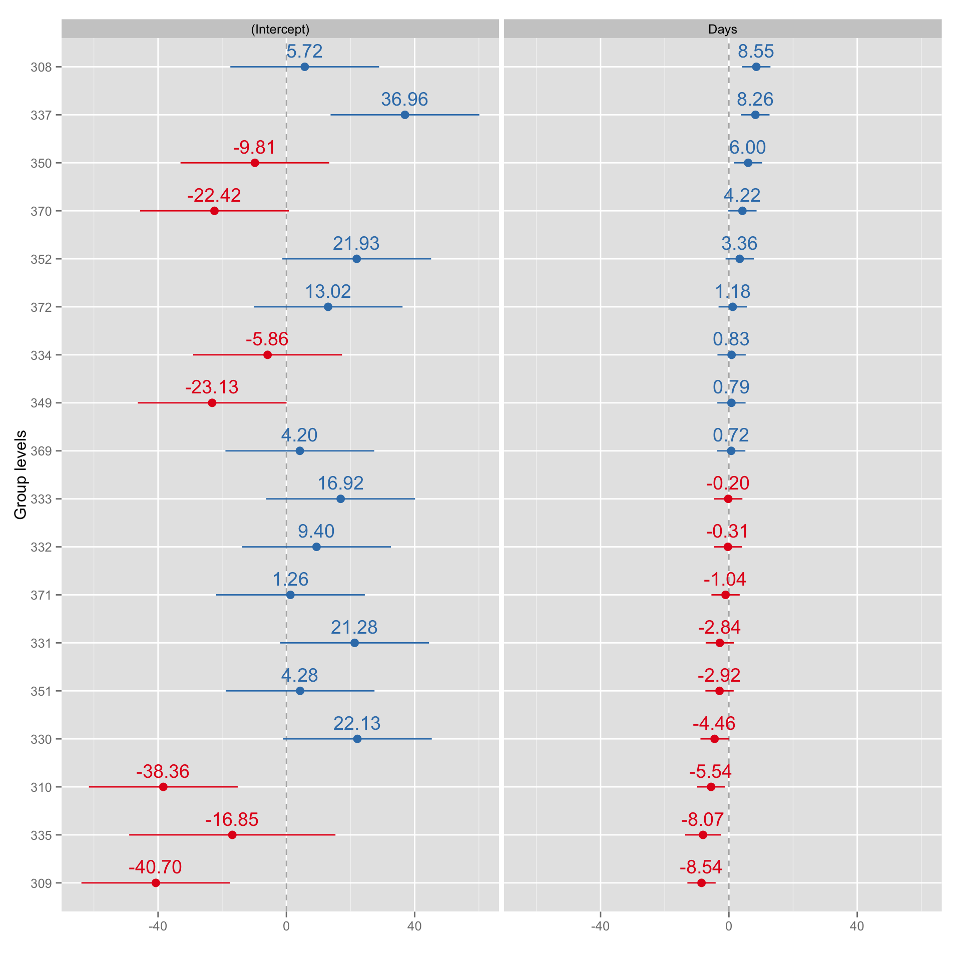



Responses