Playing with R, ggplot2 and knitr
Over the last month I have been learning R programming language that is completely FREE and used extensively in statistics and data analysis. I have been also playing with ggplot2 which is a great graphics package for R, along with knitr which was used to produce this blog post/report.
In this short demo, besides bragging with my newly acquired skillz, I wanted to give an example for power calculation in uniform (same speed) circular motion for my friend Michael Clarkson from UK. This was a part of our discussion on difference between running at the same velocity on a straight line, and running on that same velocity in the circle (air resistanc disregarded) in terms of Power production. In the simple dot mass model, in which we are going to represent human body with a dot with a mass of m we are going to disregard air resistance, body oscilations and limb movements. According to this simple model, because the velocity is same all the time, the Power output will be zero. Of course, this is not the case in real life.
The goal of this exercise is to play with vector multiplication and to check if the power is different than zero in uniform circular motion.
[sociallocker]
Let’s generate some data in a data.frame called sample
# create time vector that contains our samplings time.
sample <- data.frame(time = seq(from = 0, to = 1, by = 1/1e+05))

# Calculate time difference or dt used for velocity and acceleration
# differentiation
sample$dt <- with(sample, c(NA, diff(time)))

# Create angular velocity of the object in rad/s
sample$angular.velocity <- 10

# Create radius of the circle
sample$radius <- 2

# Create mass of the object
sample$mass <- 10
This how the sample data.frame looks like
str(sample)
## 'data.frame':    100001 obs. of  5 variables:
##  $ time            : num  0e+00 1e-05 2e-05 3e-05 4e-05 5e-05 6e-05 7e-05 8e-05 9e-05 ...
##  $ dt              : num  NA 1e-05 1e-05 1e-05 1e-05 1e-05 1e-05 1e-05 1e-05 1e-05 ...
##  $ angular.velocity: num  10 10 10 10 10 10 10 10 10 10 ...
##  $ radius          : num  2 2 2 2 2 2 2 2 2 2 ...
##  $ mass            : num  10 10 10 10 10 10 10 10 10 10 ...
From these parameters that are already in sample data.frame we will generate x and y cordinates of the object.
# Calculate X position
sample$x <- with(sample, sin(time * angular.velocity) * radius)

# Calculate Y position
sample$y <- with(sample, cos(time * angular.velocity) * radius)
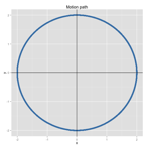
On the following graph we can se the path of the object
# Load the ggplot2 package
library(ggplot2)

ggplot(sample, aes(x = x, y = y)) + geom_point(color = "steelblue", size = 2,
    alpha = 1/2) + labs(title = "Motion path") + geom_hline() + geom_vline()
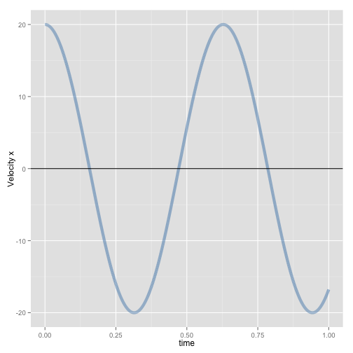
Now we have positional data and dt or time difference between sampling. We will use this to get velocity for x component and y component (velocity is a vector and we will represent it with x and y components). I beleive this is called reverse dynamics (where you estimate velocity, acceleration and force from positional and time data )
velocity_x = dx / dt
Where dx is chnage in x position between two samples (x2 – x1) and dt is change in time (we have already calculated this when designing the data.frame)
# Calculate velocity for x component
sample$vx <- with(sample, c(NA, diff(x))/dt)

# Calculate velocity for y component
sample$vy <- with(sample, c(NA, diff(y))/dt)
We can now plot velocity (x component)
ggplot(sample, aes(x = time, y = vx)) + geom_path(color = "steelblue", size = 2,
    alpha = 1/2, na.rm = TRUE) + labs(y = "Velocity x") + geom_hline()
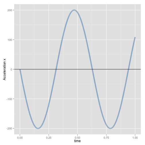
Having velocity data we can calculate acceleration and force, where
acceleration_x = dvelocity_x / dt
Force_x = acceleration_x X mass
# Calculate acceleration for x component
sample$ax <- with(sample, c(NA, diff(vx))/dt)

# Calculate acceleration for y component
sample$ay <- with(sample, c(NA, diff(vy))/dt)

# Calculate force for x and y directions
sample$fx <- with(sample, ax * mass)
sample$fy <- with(sample, ay * mass)
One the following picture is the graph of acceleration (x component)
ggplot(sample, aes(x = time, y = ax)) + geom_path(color = "steelblue", size = 2,
    alpha = 1/2, na.rm = TRUE) + labs(y = "Acceleration x") + geom_hline()
Now it is time to calculate power on x and on y (scalar product)
# Calculate power for x component and y component
sample$px <- with(sample, vx * fx)
sample$py <- with(sample, vy * fy)
Here is the graph of Power (x component)
ggplot(sample, aes(x = time, y = px)) + geom_path(color = "steelblue", size = 2,
    alpha = 1/2, na.rm = TRUE) + labs(y = "Power x") + geom_hline()
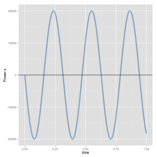
It seems that the power is fluctuating, but what happens when we calculate total power (sum of x and y component power; power is scalar so we can just add them) and visualize it?
sample$total.power <- with(sample, px + py)
ggplot(sample, aes(x = time, y = total.power)) + geom_path(color = "steelblue",
    size = 2, alpha = 1/2, na.rm = TRUE) + labs(y = "Total Power") + geom_hline()
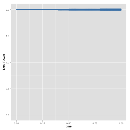
Because centripetal force is acting on the object, and that force is perpendicular to the velocity vector, there is no work done by this force and hence power is zero. On the graph above you can see that Total Power has some value – this is constant error due sampling frequency. Higher the sample frequency, lower the error (will see the relationship later)
Another way to calculate total power would be to use scalar velocity
# Calculate scalar velocity from angular velocity and radius
sample$v = with(sample, angular.velocity * radius)

# Calculate acceleration from change in scalar velocity divided by dt
sample$a = with(sample, c(NA, diff(v))/dt)

# Calculate force acting on the object
sample$f = with(sample, a * mass)

# Calculate power
sample$p = with(sample, f * v)

# Plot power calculated
ggplot(sample, aes(x = time, y = p)) + geom_path(color = "steelblue", size = 2,
    alpha = 1/2, na.rm = TRUE) + labs(y = "Total Power") + geom_hline()
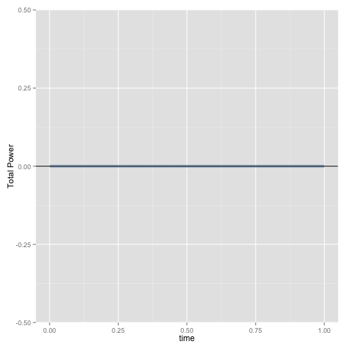
Now we can see that the total power is zero (in this simple model, NOT the real life). Let’s code a function that calculates the mean total power for sampling frequency. This will involve copying the whole code above, but changing sampling frequency
mean.total.power <- function(frequency = 100) {

    sample <- data.frame(time = seq(from = 0, to = 1, by = 1/frequency))
    sample$dt <- with(sample, c(NA, diff(time)))
    sample$angular.velocity <- 10
    sample$radius <- 2
    sample$mass <- 10
    sample$x <- with(sample, sin(time * angular.velocity) * radius)
    sample$y <- with(sample, cos(time * angular.velocity) * radius)
    sample$vx <- with(sample, c(NA, diff(x))/dt)
    sample$vy <- with(sample, c(NA, diff(y))/dt)
    sample$ax <- with(sample, c(NA, diff(vx))/dt)
    sample$ay <- with(sample, c(NA, diff(vy))/dt)
    sample$fx <- with(sample, ax * mass)
    sample$fy <- with(sample, ay * mass)
    sample$px <- with(sample, vx * fx)
    sample$py <- with(sample, vy * fy)
    sample$total.power <- with(sample, px + py)
    return(mean(sample$total.power, na.rm = TRUE))
}
Now we can see how does the error in Total Power behaves with different sampling frequencies. We are going to create a vector (series of data) that contains sampling frequencies – 10, 100, 1000, etc and pass that to the function. We are going to graph the error against sampling frequency. If you run this on your computer it is going to take some time.
probing.data <- data.frame(frequency = seq(from = 500, to = 1e+05, by = 1000))  # Different sampling frequencies
probing.data$power = with(probing.data, numeric(length(frequency)))  # This contains the results

for (i in seq_along(probing.data$frequency)) {
    probing.data$power[i] <- mean.total.power(probing.data$frequency[i])
}

ggplot(probing.data, aes(x = frequency, y = power)) + geom_path(color = "steelblue",
    size = 2, alpha = 1/2, na.rm = TRUE) + labs(y = "Total Power") + geom_hline()
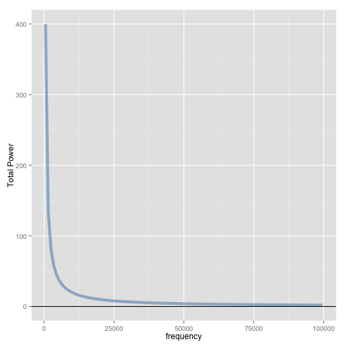
If we do this on other indices, like velocity and acceleration we won’t see such a change based on sampling frequency. Let’s try – we just need to modify the written function to return the maximum of acceleration on x.
max.x.acceleration <- function(frequency = 100) {

    sample <- data.frame(time = seq(from = 0, to = 1, by = 1/frequency))
    sample$dt <- with(sample, c(NA, diff(time)))
    sample$angular.velocity <- 10
    sample$radius <- 2
    sample$mass <- 10
    sample$x <- with(sample, sin(time * angular.velocity) * radius)
    sample$y <- with(sample, cos(time * angular.velocity) * radius)
    sample$vx <- with(sample, c(NA, diff(x))/dt)
    sample$vy <- with(sample, c(NA, diff(y))/dt)
    sample$ax <- with(sample, c(NA, diff(vx))/dt)
    sample$ay <- with(sample, c(NA, diff(vy))/dt)
    return(max(sample$ax, na.rm = TRUE))
}
And code the same probing procedure as we did for error in total power calculus
probing.data <- data.frame(frequency = seq(from = 500, to = 1e+05, by = 1000))  # Different sampling frequencies
probing.data$acceleration = with(probing.data, numeric(length(frequency)))  # This contains the results

for (i in seq_along(probing.data$frequency)) {
    probing.data$acceleration[i] <- max.x.acceleration(probing.data$frequency[i])
}

ggplot(probing.data, aes(x = frequency, y = acceleration)) + geom_path(color = "steelblue",
    size = 2, alpha = 1/2, na.rm = TRUE) + labs(y = "Max calculated acceleration") +
    geom_hline()
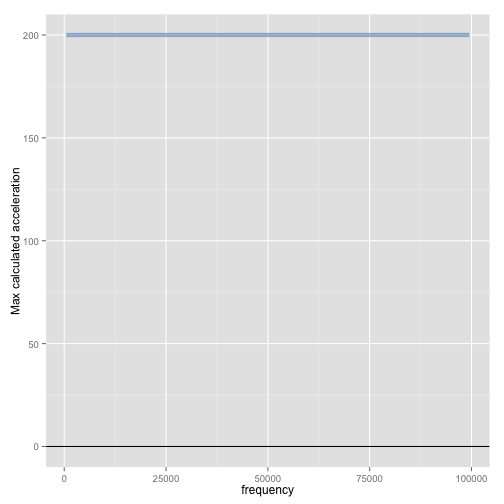
As can be seen from the plot, maximal acceleretaion (x comp) is always the same regardles of the sampling frequency.
I hope that this demonstration of R, ggplot and knitr and my simulation knowledge didn’t cause major headache.
I will be using R more and more and my next project is something that will be of interest for sport scientists interested in metabolic power measurement using GPS with the goal of real-time tracking of fatigue.
Stay tuned….
[/sociallocker]




Responses