Playbook: Exploring decathlon competition data – Part 2
Click HERE to read part 1
Clustering
What we might be interested next is similarities between athletes, or in other words, which athletes have similar profiles. For that purpose we can use Hierarchical Clustering and Principal Component Analysis (PCA) which we are going to cover later
HCWard <- hclust(d = dist(decathlon.normal[2:11]), method = "ward")

plot(HCWard, xlab = "", ylab = "", yaxt = "n", main = "Athletes")
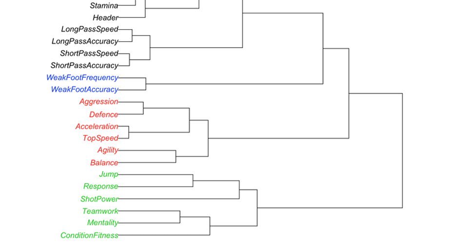
We can do the same for events – try to find events that are similar (dependent of similar quality, e.g. speed, explosive power, endurance, etc)
HCWard <- hclust(d = dist(t(decathlon.normal[2:11])), method = "ward")

plot(HCWard, xlab = "", ylab = "", yaxt = "n", main = "Events")
Some of the groupings seems pretty reasonable (100m, 110m Hurdles, 400m and long jump), while others might not seem so reasonable (Javeline and 1500m). This is related to this data set and to make generalizations to a population we need a lot bigger sample.
Correlation Matrix
Another way to get an insigh how events are related is to do correlation matrix.
Before we do that we will plot scatter matrix. In simple English it is scatter plot for each pair of variables.
plotmatrix(decathlon.normal[-1]) + geom_smooth(method = "lm")
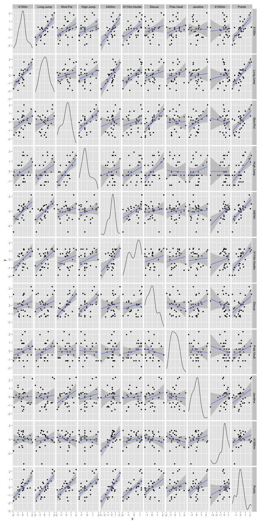
Next, we should calculate correlation matrix, or correlation between each pair of events.
| X100m | Long.Jump | Shot.Put | High.Jump | X400m | X110m.Hurdle | Discus | Pole.Vault | Javeline | X1500m | |
|---|---|---|---|---|---|---|---|---|---|---|
| X100m | 1.00 | -0.70 | -0.37 | -0.31 | 0.63 | 0.54 | -0.23 | -0.26 | -0.01 | 0.06 |
| Long.Jump | -0.70 | 1.00 | 0.20 | 0.35 | -0.67 | -0.54 | 0.25 | 0.29 | 0.09 | -0.15 |
| Shot.Put | -0.37 | 0.20 | 1.00 | 0.61 | -0.20 | -0.25 | 0.67 | 0.02 | 0.38 | 0.13 |
| High.Jump | -0.31 | 0.35 | 0.61 | 1.00 | -0.17 | -0.33 | 0.52 | -0.04 | 0.20 | -0.00 |
| X400m | 0.63 | -0.67 | -0.20 | -0.17 | 1.00 | 0.52 | -0.14 | -0.12 | -0.05 | 0.55 |
| X110m.Hurdle | 0.54 | -0.54 | -0.25 | -0.33 | 0.52 | 1.00 | -0.22 | -0.15 | -0.08 | 0.18 |
| Discus | -0.23 | 0.25 | 0.67 | 0.52 | -0.14 | -0.22 | 1.00 | -0.18 | 0.25 | 0.22 |
| Pole.Vault | -0.26 | 0.29 | 0.02 | -0.04 | -0.12 | -0.15 | -0.18 | 1.00 | -0.07 | 0.18 |
| Javeline | -0.01 | 0.09 | 0.38 | 0.20 | -0.05 | -0.08 | 0.25 | -0.07 | 1.00 | -0.25 |
| X1500m | 0.06 | -0.15 | 0.13 | -0.00 | 0.55 | 0.18 | 0.22 | 0.18 | -0.25 | 1.00 |
Principal Component Analysis
Using very useful package FactoMineR we can quickly perform Principal Component Analysis. PCA, similar to Clustering is a dimension reduction approach. What we want to do is to analyze the Events (or variables) and athletes (or individuals) with the goal of finding similarities between them and combining those two (if they variables analysis make sense).
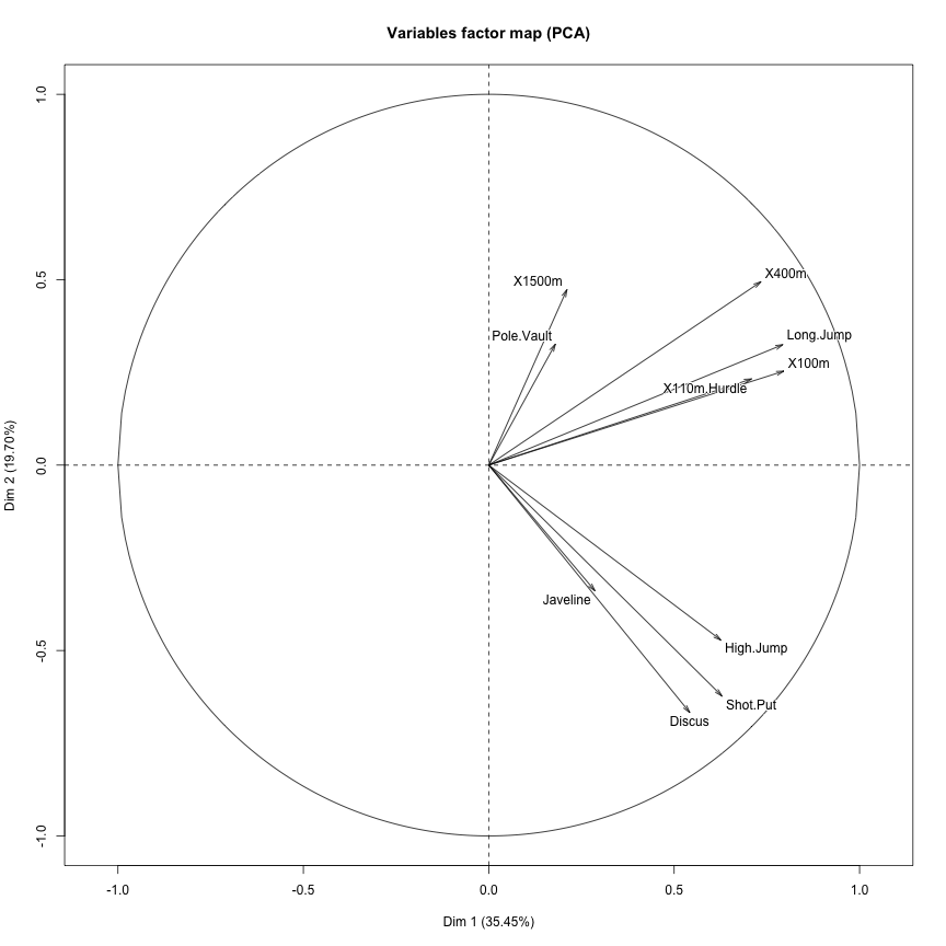
res <- PCA(decathlon.normal[2:11])
Similar to Clustering, with PCA we can see that certain events correlate nicely with each other, and not with others.
Here is the contribution of events to each principal component
contribution <- as.data.frame(res$var$contrib)
contribution$Event <- rownames(contribution)

contribution <- melt(contribution, id.vars = "Event", value.name = "Contribution",
    variable.name = "Principal.Component")

gg <- ggplot(contribution, aes(x = Event, y = Contribution))
gg <- gg + geom_bar(stat = "identity", fill = "blue", alpha = 0.5)
gg <- gg + coord_flip()
gg <- gg + facet_wrap(~Principal.Component, ncol = 2)
gg
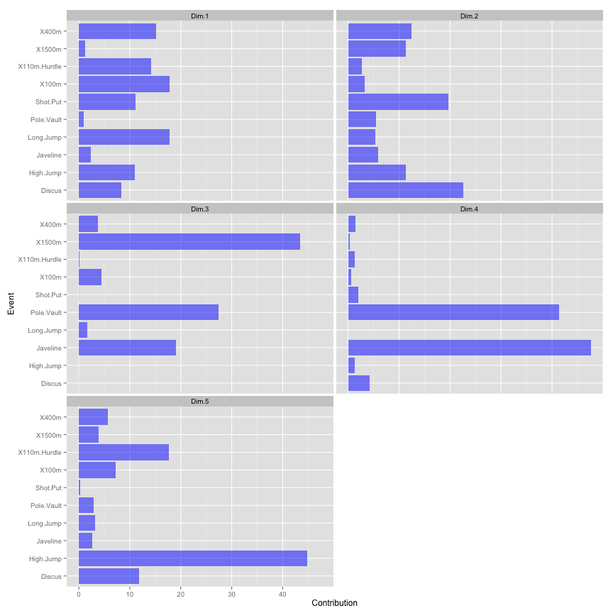
In this case components 1 (Dim.1) could be names “Speed” since it is mostly influenced by 100m, 110mH, 400m and long jump. Component 2 could be names “Explosive Power” since it is mostly influenced by shot put and discus, and component 3 could be names “Endurance” since it is mostly influenced by 1500m, and so forth.
Sometimes this is can be completely useless, but in this case it yields some interesting groupings.
Let’s see how the athletes’ profiles based on those components
players.PCA <- as.data.frame(res$ind$coord)
players.PCA$Athlete <- rownames(players.PCA)

players.PCA <- melt(players.PCA, id.vars = "Athlete", value.name = "Z.Score",
    variable.name = "Principal.Component")

# Sort the components and athletes
players.PCA$Principal.Component = with(players.PCA, factor(Principal.Component,
    levels = rev(levels(Principal.Component))))

gg <- ggplot(players.PCA, aes(x = Principal.Component, y = Z.Score))
gg <- gg + geom_bar(stat = "identity", fill = "blue", alpha = 0.5)
gg <- gg + coord_flip()
gg <- gg + facet_wrap(~Athlete, ncol = 3)
gg
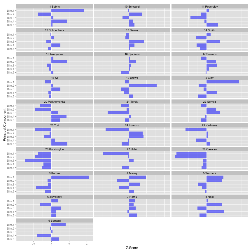
It is always important to go back to the raw data to inspect our findings. For this reason I am posting normalized table, so we can inspect athlete profiles from PCA with raw data. You can also check the athlete profiles using Z-Scores
# Create the interactive table
dec.norm.table <- gvisTable(cbind(decathlon.normal[1], round(decathlon.normal[-1],
    2)), options = list(height = 500, width = 800, formats = "#.##"))

print(dec.norm.table, "chart")
[iframe src=”http://complementarytraining.net/wp-content/uploads/2013/10/Exploring-Decathlon-chart2.html” scrolling=”yes” class=”iframe-class” height=”550px” width=”100%” frameborder=”0″ align=”center”]
Hopefully this all made some sense. Now go ahead and anlyze your own data.




Responses