AthleteSR Monitoring Dashboard
A Simple and Transparent System for Athlete Monitoring
Are you collecting athlete monitoring data but struggling to turn it into clear, usable insights?
Missing data. Multiple sessions in one day. Body diagram data that feels useful, but is hard to trust. And spreadsheets that fall apart once time series and assumptions come into play.
This is exactly the gap the AthleteSR Monitoring Dashboard is designed to solve.
What Makes This System Different?
Athlete monitoring is not about collecting more data. It is about making sense of the data you already have.
The AthleteSR Monitoring Dashboard allows you to:
- view data over time, not as isolated values
- identify trends and variability, not just averages
- compare individual athletes with group trends
- clearly see and adjust the assumptions behind the analysis
Instead of hiding decisions inside a black box, the system makes them explicit and adjustable.
Transparent Data Handling
Every analytical assumption in the dashboard is visible and adjustable in real time.
Missing a Tuesday wellness entry? You decide whether to leave it missing or assume zero for training load. Multiple HRV readings in one day? You choose whether to sum or average them.
Each change updates the analysis immediately, so you can see how your choices affect the outputs.
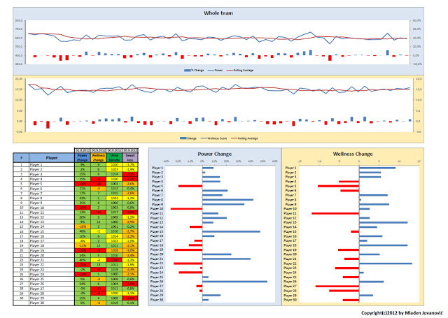
Group vs. Individual Context
The dashboard allows you to view individual athletes against group trends.
For example, during an intensive training block, a collective drop in group HRV may be expected. But the dashboard also highlights the athlete whose response clearly differs from the rest. That is the signal worth investigating.
Group percentiles remain visible as you switch between athletes, keeping deviations clear and contextualized.
Making Sense of Body Diagram Data
Body diagram data has long been one of the hardest parts of athlete monitoring to work with. Each body region acts as a separate variable, which quickly complicates analysis.
The dashboard addresses this by allowing you to:
- aggregate body diagram entries per day
- identify sensitive or problematic regions quickly
- track changes over time
- compare individual patterns with team-wide trends
- visualize data on an interactive body map, including animations
This turns subjective reports into readable, contextualized information. You can see whether hamstring soreness affects one athlete or is emerging as a team-wide pattern.
Intro video
See the full workflow, from collecting data in AthleteSR (including kiosk mode) to syncing it with the dashboard and visualizing the results.
In-depth video
Understand the analytical logic behind the dashboard:
- data preparation and aggregation
- acute and chronic windows
- missing data handling
- trend and variability interpretation
- body diagram analysis
As a Complementary Training member, you have free access to AthleteSR, along with the AthleteSR Monitoring Dashboard shown in the videos above.
This means you can explore the complete workflow immediately, using the same tools and sample data demonstrated in the videos.


Responses