Optimal Force-Velocity Profile for Sprinting: Is It All Bollocks? – Part 4
In the previous installment, I have demonstrated how to perform sensitivity/optimization analysis of the Acceleration-Velocity Profile (AVP) using (1) probing method and (2) slope method. In this installment I will explain how to do it using the Force-Velocity Profile (FVP).
As we have learned previously, the sensitivity/optimization analysis plays with the parameters under certain constraints (i.e., increase for certain % amount for the probing method, or change in slope while keeping the $P_{max}$ the same for the slope method) to yield the lowest split times. Rather than using MSS and MAC parameters to calculate model predicted split times, we can use $F_0$ and $V_0$ to do so, since they are estimated using MSS and MAC themselves (speaking about the polynomial method explained previously).
Math is more involved (and covered in Samozino et al. (2022)), but I will cover the simple logic here using Equation 1.
\begin{split}
t(d) = f(d, \; F_0, \; V_0, \; k)\\\end{split}Equation 1
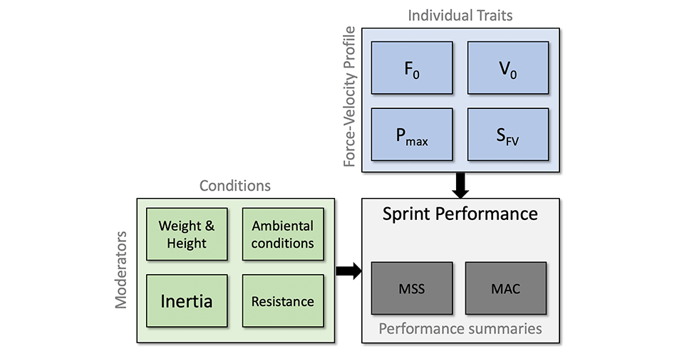
Model predicted split times depends on distance selected, $F_0$ and $V_0$ , as well as the $k$ value, which is used to model the air resistance. As shown in Equation 2, $k$ value depends on the body weight, body height, air pressure, air temperature and wind velocity.
\begin{split}
k = f(weight, \;height, \;Pressure, \;Temp, \;v_{wind})\\\end{split}Equation 2
In the previous installment we have used athlete with known/true MSS (maximum-sprinting-speed) equal to 9 $ms^{-1}$ and MAC (maximum-acceleration) equal to 8 $ms^{-2}$. These are model parameters that we will use to generate the data (again, we are using model predictions). These parameters gives us TAU of 1.125 $s$ and $P_{max}$ equal to 18 $W/kg$.
Using the method explained in the previous installments, and assuming our athlete wights 85kg with a body height of 185cm, we can estimate $F_0$ and $V_0$ (using polynomial method) (Table 1).
Show/Hide Code
require(tidyverse)
require(shorts)
require(cowplot)
require(directlabels)
require(kableExtra)

athlete_MSS <- 9
athlete_MAC <- 8
athlete_BW <- 85
athlete_height <- 1.85

# Get FVP
fvp <- make_FV_profile(
  athlete_MSS,
  athlete_MAC,
  bodymass = athlete_BW,
  bodyheight = athlete_height
)

athlete_F0 <- fvp$F0_poly
athlete_F0_rel <- fvp$F0_poly_rel
athlete_V0 <- fvp$V0_poly
athlete_PMAX <- fvp$Pmax_poly
athlete_PMAX_rel <- fvp$Pmax_poly_rel
athlete_Slope <- fvp$FV_slope

athlete_Ppeak <- shorts:::find_FV_peak_power(
  athlete_F0,
  athlete_V0,
  bodymass = athlete_BW,
  bodyheight = athlete_height
)
athlete_Ppeak_rel <- athlete_Ppeak / athlete_BW


df <- tribble(
  ~`MSS (m/s)`, ~`MAC (m/s/s)`, ~`TAU (s)`, ~`AV Slope`, ~`net PMAX (W/kg)`, ~`Weight (kg)`, ~`Height (m)`, ~`F0 (N)`, ~`rel F0 (N/kg)`, ~`V0 (m/s)`, ~`PMAX (W)`, ~`rel PMAX (W/kg)`, ~`FV Slope`, ~`Ppeak (W)`, ~`rel Peak (W/kg)`,
  athlete_MSS, athlete_MAC, athlete_MSS / athlete_MAC, -athlete_MAC / athlete_MSS, athlete_MSS * athlete_MAC / 4, athlete_BW, athlete_height, athlete_F0, athlete_F0_rel, athlete_V0, athlete_PMAX, athlete_PMAX_rel, athlete_Slope,
  athlete_Ppeak, athlete_Ppeak_rel
)

kbl(t(df), digits = 2) %>%
  kable_classic(full_width = FALSE) %>%
  pack_rows("Acceleration-Velocity Profile", 1, 5) %>%
  pack_rows("Force-Velocity Profile", 6, 15)
| Acceleration-Velocity Profile | |
|---|---|
| MSS (m/s) | 9.00 |
| MAC (m/s/s) | 8.00 |
| TAU (s) | 1.12 |
| AV Slope | -0.89 |
| net PMAX (W/kg) | 18.00 |
| Force-Velocity Profile | |
| Weight (kg) | 85.00 |
| Height (m) | 1.85 |
| F0 (N) | 680.00 |
| rel F0 (N/kg) | 8.00 |
| V0 (m/s) | 9.34 |
| PMAX (W) | 1588.19 |
| rel PMAX (W/kg) | 18.68 |
| FV Slope | -0.85 |
| Ppeak (W) | 1558.14 |
| rel Peak (W/kg) | 18.33 |
Table 1: Athlete characteristics
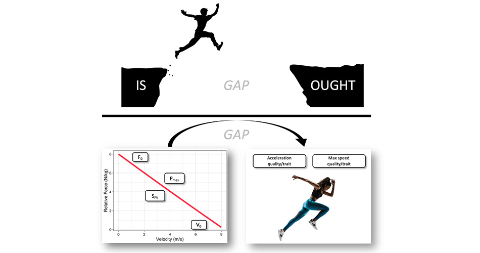
Why FVP and not just AVP?
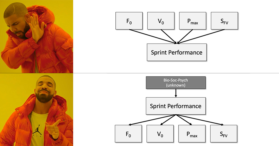
Why do we need Force-Velocity Profile (FVP) and not just Acceleration-Velocity Profile (AVP)? I should have addressed this question in the previous installments, but I think this is a good time for this interlude.
This is a great question to ask. In my instrumentalist viewpoint, they are both summaries of performance. But for someone taking realist stance, AVP is a summary of performance, while FVP is determinant of performance. In other words, FVP causes AVP. Thus, FVP reveals individual traits/qualities that are causes or determinants of performance. I do not succumb to such a viewpoint. Simply, if you cue someone with a small technique improvement, sprint performance will improve, and thus the FVP. I thus, believe both FVP and AVP are simply summaries of sprint performance, a NOT determinants.
But anyway, let us us “fuck-around-and-find-out” with a realist perspective using FVP as a cause of performance, summarized by AVP. Since FVP is estimated using AVP and body dimensions (weight and height) as well as air pressure, air temperature and wind velocity, we can reverse this, and use FVP as a generative model to estimate AVP from FVP (I will not bother you with math, but you can do it yourself by reading Samozino et al. (2022)). Under realist perspective, if my FVP is fixed (with some biological variation, but for this thought experiment, we will assume it is), then changes in air pressure, air temperature and wind velocity, but most notably in body weight, will affect my sprint performance (which is summarized by AVP).
Let us explore this by calculating effects of simulated changes in $F_0$, $V_0$ and body weight on the AVP (MSS and MAC parameters). These are depicted in Figure 1.
Show/Hide Code
model_sens_df <- data.frame(
  F0 = athlete_F0,
  V0 = athlete_V0,
  BW = athlete_BW
  ) %>%
  expand_grid(
    increase = c("F0", "V0", "BW"),
    factor = seq(80, 120)) %>%
  mutate(
    bodymass = athlete_BW,
    increase = factor(increase, levels = c("F0", "V0", "BW")),
    new_F0 = ifelse(increase == "F0", F0 * factor / 100, F0),
    new_V0 = ifelse(increase == "V0", V0 * factor / 100, V0),
    new_BW = ifelse(increase == "BW", BW * (factor / 100), BW)) %>%
  mutate(data.frame(shorts:::convert_FV(new_F0, new_V0, bodymass = new_BW, bodyheight = athlete_height))) %>%
  pivot_longer(cols = c(MSS, MAC), names_to = "param")

# Plot
ggplot(model_sens_df, aes(x = factor - 100, y = value, color = param)) +
  theme_linedraw(8) +
  geom_vline(xintercept = 0, linetype = "dashed") +
  geom_line(alpha = 0.6) +
  geom_dl(
    aes(label = paste("  ", param)),
    method = list("last.bumpup", cex = 0.5)
  ) +
  facet_wrap(~increase) +
  ylab(NULL) +
  xlab("Parameter Improvement (%)") +
  theme(legend.position = "none") +
  xlim(-20, 27.5)
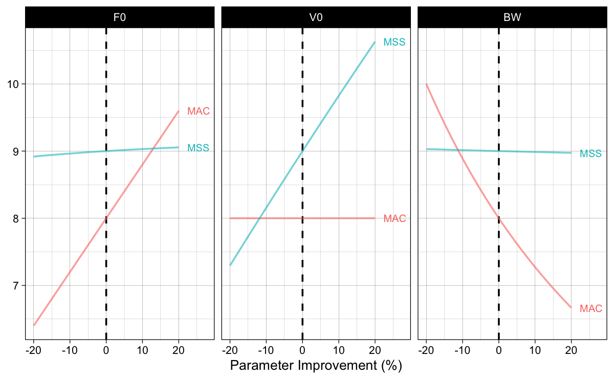
Figure 1: Using FVP as generative model and estimating effects of change in parameters on the sprint performance summarized with AVP
Interesting finding of this thought experiment (also a form of sensitivity analysis or “fuck-around-and-find-out”) in Figure 1, is that, assuming $F_0$ and $V_0$ being causal qualities/traits independent of body weight, changing body weight will not influence MSS, or maximum achievable sprinting speed. This is a normal conclusion of such a realist perspective using map as a territory, but little bit of common-sense and research (of which I am not currently aware of) can bring this into question. For example, if I attach 10% of body weight in a form of a weighted vest, ankle or wrist weight, or frictionless sled, I am pretty sure that the (1) estimated MSS will definitely not be the same, and (2) estimated FVP for that loaded performance will also be different. This simple “fuck-around-and-find-out” in the Large World (a.k.a., experiment) breaks the realist assumptions of the FVP being determinant of performance. If it was determinant or a causal mechanism, then predictions from the “fuck-around-and-find-out” in the Small World (Figure 1) would be found the be true in the Large World. I am not aware of any research doing this type of analysis, but here is a potential topic for a research paper or even PhD – well maybe I can do this?
We can thus get back to real life and accept that FVP nor $P_{max}$ are not some magical determinants we need to focus on (e.g., plenty of research on finding loads that maximize power, yada yada yada), but results of performance itself. Let’s get back to our sensitivity analysis in the Small World.
Optimization of the Force-Velocity Profile
Using exactly the same probing method we have done in the previous installment using the AVP, and our athlete from Table 1, we can now perform sensitivity analysis of the model (i.e., map) by changing $F_0$, $V_0$, and body weight to check the effects on model predicted split times. The results are depicted in Figure 2. Please note that improvement in body weight mean reducing body weight for enlisted percentage.
Show/Hide Code
# Generate data
model_sens_df <- data.frame(
  F0 = athlete_F0,
  V0 = athlete_V0,
  BW = athlete_BW
  ) %>%
  expand_grid(
    distance = seq(5, 45, by = 5),
    increase = c("F0", "V0", "BW"),
    factor = seq(100, 120)) %>%
  mutate(
    distance_label = factor(paste(distance, "m"), levels = paste(seq(5, 45, by = 5), "m")),
    increase = factor(increase, levels = c("F0", "V0", "BW")),
    time = predict_time_at_distance_FV(distance, F0, V0, bodymass = BW, bodyheight = athlete_height),
    new_F0 = ifelse(increase == "F0", F0 * factor / 100, F0),
    new_V0 = ifelse(increase == "V0", V0 * factor / 100, V0),
    new_BW = ifelse(increase == "BW", BW / (factor / 100), BW),
    new_time = predict_time_at_distance_FV(distance, new_F0, new_V0, bodymass = new_BW, bodyheight = athlete_height),
    time_diff = new_time - time,
    time_perc_diff = -time_diff / time * 100
  )

# Plot
ggplot(model_sens_df, aes(x = factor - 100, y = new_time, group = distance_label)) +
  theme_linedraw(8) +
  geom_line(alpha = 0.6, color = "dark blue") +
  geom_dl(
    aes(label = paste("  ", distance_label)),
    method = list("last.bumpup", cex = 0.5)
  ) +
  facet_wrap(~increase) +
  ylab("Time (s)") +
  xlab("Parameter Improvement (%)") +
  xlim(0, 25)
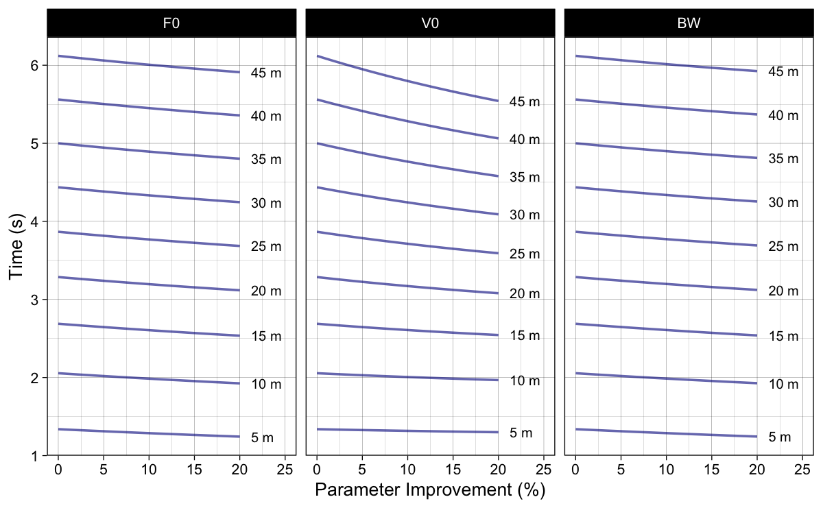
Figure 2: Model predicted split times when parameters are improved for certain percentage. Please note that improvement in body weight mean reducing body weight for enlisted percentage
Figure 3 depicts results of the simple sensitivity analysis using percent split time improvement.
Show/Hide Code
ggplot(model_sens_df, aes(x = factor - 100, y = time_perc_diff, group = distance_label)) +
  theme_linedraw(8) +
  geom_abline(slope = 1, linetype = "dotted", color = "dark grey") +
  geom_line(alpha = 0.6, color = "dark blue") +
  geom_dl(
    aes(label = paste("  ", distance_label)),
    method = list("last.bumpup", cex = 0.5)
  ) +
  facet_wrap(~increase) +
  ylab("Time improvement (%)") +
  xlab("Parameter Improvement (%)") +
  xlim(0, 25)
  #ylim(-0.7, 0.2)
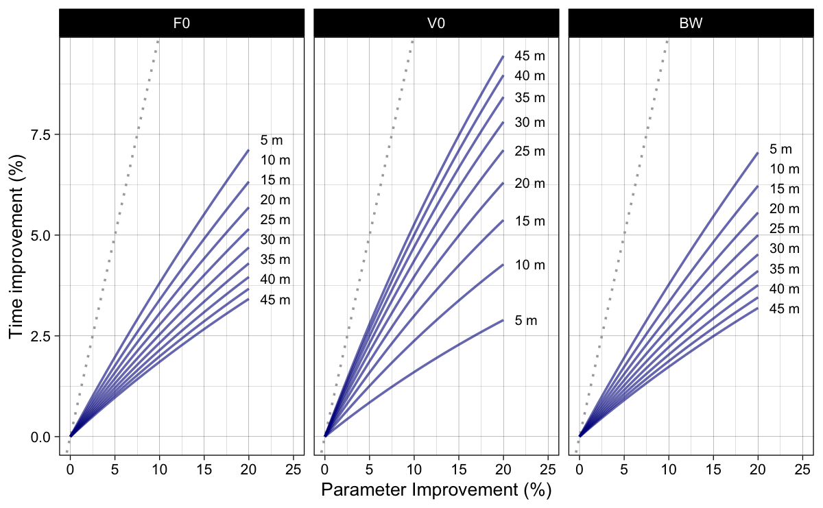
Figure 3: Model predicted split time improvements (in percentage) when parameters are improved for certain percentage. Dotted line represent identity line (i.e., slope 1)
To answer the “improving which model parameter yields higher split times improvement?” question, we can re-organize results from Figure 3 into Figure 4.
Show/Hide Code
ggplot(model_sens_df, aes(x = factor - 100, y = time_perc_diff, color = increase)) +
  theme_linedraw(8) +
  geom_abline(slope = 1, linetype = "dotted", color = "dark grey") +
  geom_line(alpha = 0.6) +
  geom_dl(
    aes(label = paste("  ", increase)),
    method = list("last.bumpup", cex = 0.5)
  ) +
  facet_wrap(~distance_label) +
  ylab("Time improvement (%)") +
  xlab("Parameter Improvement (%)") +
  xlim(0, 25) +
  #ylim(-0.7, 0.1) +
  scale_color_brewer(palette = "Set1") +
  theme(legend.position = "none")
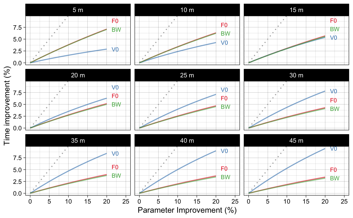
Figure 4: Model predicted split time improvements (in percentage) when parameters are improved for certain percentage. This figure answers “improving which model parameter yields higher split times improvement?” question
Using exactly the same method outlined in the previous installment when we were utilizing AVP, we can now calculate Profile Imbalance ($Profile_{IMB}$; Equation 3). Please remember that $\Delta t_{V_0}$ is the time improvement (i.e., time difference) when $V_0$ parameter changes, and $\Delta t_{F_0}$ is the time improvement when $F_0$ parameter changes. Please refer to previous installment for more information.
\begin{split}
Profile_{IMB} = 100 \times \frac{\Delta t_{V_0}}{\Delta t_{F_0}}\\\end{split}Equation 3
Calculated $Profile_{IMB}$ is depicted in Figure 5.
Show/Hide Code
# Generate data
model_sens_df <- data.frame(
  F0 = athlete_F0,
  V0 = athlete_V0,
  BW = athlete_BW
  ) %>%
  expand_grid(
    distance = seq(5, 45, by = 5),
    factor = seq(100, 120)) %>%
  mutate(
    distance_label = factor(paste(distance, "m"), levels = paste(seq(5, 45, by = 5), "m")),
    time = predict_time_at_distance_FV(distance, F0, V0, bodymass = BW, bodyheight = athlete_height),
    new_F0 = F0 * factor / 100,
    new_V0 = V0 * factor / 100,
    new_F0_time = predict_time_at_distance_FV(distance, new_F0, V0, bodymass = BW, bodyheight = athlete_height),
    new_V0_time = predict_time_at_distance_FV(distance, F0, new_V0, bodymass = BW, bodyheight = athlete_height),
    new_F0_time_diff = new_F0_time - time,
    new_V0_time_diff = new_V0_time - time,
    profile_IMB = new_V0_time_diff / new_F0_time_diff * 100
  )

# Plot
ggplot(model_sens_df, aes(x = factor - 100, y = profile_IMB, group = distance_label)) +
  theme_linedraw(8) +
  geom_hline(yintercept = 100, linetype = "dashed") +
  annotate("segment", x = 0.5, xend = 0.5, y = 105, yend = 300, color = "dark grey",
           size = 1, arrow = arrow(type = "closed", length = unit(0.2, "cm"))) +
  annotate("text", x = 0, y = 200, size = 3, angle = 90, label = "Veloc Def", vjust = "bottom", color = "dark grey") +
  annotate("segment", x = 0.5, xend = 0.5, y = 95, yend = 40, color = "dark grey",
           size = 1, arrow = arrow(type = "closed", length = unit(0.2, "cm"))) +
  annotate("text", x = 0, y = 60, size = 3, angle = 90, label = "Force Def", vjust = "bottom", color = "dark grey") +
  geom_line(alpha = 0.6, color = "dark blue") +
  geom_dl(
    aes(label = paste("  ", distance_label)),
    method = list("last.bumpup", cex = 0.5)
  ) +
  ylab("Profile Imbalance (%)") +
  xlab("Parameter Improvement (%)") +
  xlim(0, 22.5)
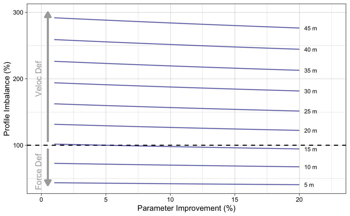
Figure 5: Calculated Profile Imbalance using Equation 3 across different parameter improvements
To simplify Figure 5 (since lines are parallel), let’s plot probing results using 5% only (Figure 6).
Show/Hide Code
model_sens_df <- model_sens_df %>%
  filter(factor == 105)

ggplot(model_sens_df, aes(x = distance, y = profile_IMB)) +
  theme_linedraw(8) +
  geom_hline(yintercept = 100, linetype = "dashed") +
  annotate("segment", x = 4.5, xend = 4.5, y = 105, yend = 300,  color = "dark grey",
           size = 1, arrow = arrow(type = "closed", length = unit(0.2, "cm"))) +
  annotate("text", x = 3.5, y = 200, size = 3, angle = 90, label = "Veloc Def", vjust = "bottom",  color = "dark grey") +
  annotate("segment", x = 4.5, xend = 4.5, y = 95, yend = 40,  color = "dark grey",
           size = 1, arrow = arrow(type = "closed", length = unit(0.2, "cm"))) +
  annotate("text", x = 3.5, y = 60, size = 3, angle = 90, label = "Force Def", vjust = "bottom", color = "dark grey") +
  geom_line(alpha = 0.6, color = "dark blue") +
  ylab("Profile Imbalance (%)") +
  xlab("Distance (m)")
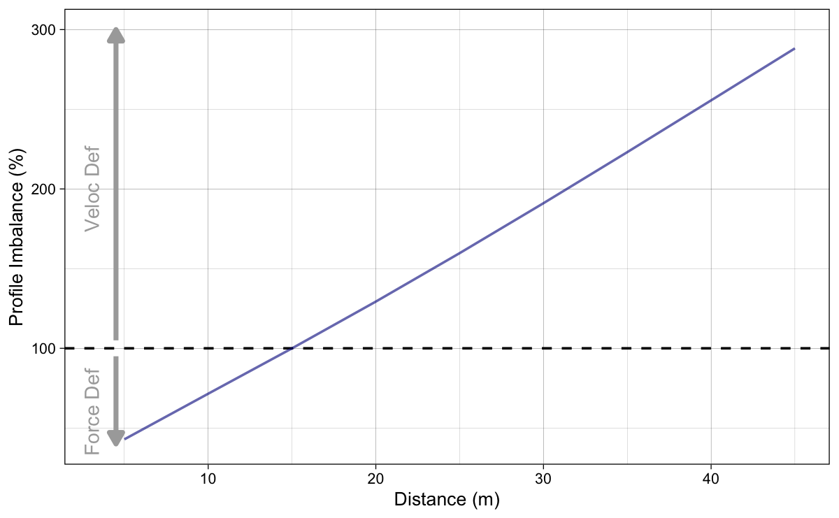
Figure 6: Calculated Profile Imbalance using Equation 3 when F_0 or V_0 parameters change for 5%
Slope method
The slope sensitivity method applied to FVP is the same as the one applied to AVP, and this is the actual method utilized in Samozino et al. (2022). The FVP profile using $F_0$ and $V_0$ can be converted to $P_{max}$ (Equation 4) and $S_{FV}$ (Equation 5), yielding the same amount of profile information, but just in another format. Unfortunately, this format and sensitivity method assumes that $P_{max}$ is something special or magical causing sprint performance. Total bollocks if you ask me. But let’s roll with that approach.
\begin{split}
P_{max} = \frac{F_0 \times V_0}{4}\\\end{split}Equation 4
\begin{split}
S_{FV} = -\frac{F_0}{V_0}\\\end{split}Equation 5
As outlined in the previous installment, we keep the $P_{max}$ by only changing slope $S_{FV}$. This is achieve by multiplying $F_0$ by coefficient $k$ (Equation 6), and also dividing $V_0$ by that same amount (Equation 7).
\begin{split}
F_0^{new} = F_0 \times k\\\end{split}Equation 6
\begin{split}
V_0^{new} = V_0 \times \frac{1}{k}\\\end{split}Equation 7
The new $S_{FV}$ is thus equal to Equation 8.
\begin{split}
S_{FV}^{new} = S_{FV} \times \frac{1}{k^2}\\\end{split}Equation 8
Figure 7 depicts split times across various levels of coefficient $k$. The dots in Figure 7 represent the best (i.e., the minimum, or fastest) split times.
Show/Hide Code
# Generate data
model_sens_df <- data.frame(
  F0 = athlete_F0,
  V0 = athlete_V0,
  BW = athlete_BW
  ) %>%
  expand_grid(
    distance = seq(5, 45, by = 5),
    factor = seq(50, 250)) %>%
  mutate(
    slope = -(F0 / BW)/V0,
    distance_label = factor(paste(distance, "m"), levels = paste(seq(5, 45, by = 5), "m")),
    time = predict_time_at_distance_FV(distance, F0, V0, bodymass = BW, bodyheight = athlete_height),
    new_F0 = F0 / (factor / 100),
    new_V0 = V0 * (factor / 100),
    new_slope = -(new_F0 / BW)/new_V0,
    new_time = predict_time_at_distance_FV(distance, new_F0, new_V0, bodymass = BW, bodyheight = athlete_height),
    time_diff = new_time - time,
    time_perc_diff = -time_diff / time * 100
  )

# Find lowest
model_sens_lowest_df <- model_sens_df %>%
  group_by(distance_label) %>%
  slice_min(new_time, n = 1) %>%
  ungroup()

# Plot
ggplot(model_sens_df, aes(x = factor, y = new_time, group = distance_label)) +
  theme_linedraw(8) +
  geom_vline(xintercept = 100, linetype = "dashed") +
  geom_line(alpha = 0.6, color = "dark blue") +
  geom_point(
    data = model_sens_lowest_df,
    aes(x = factor, y = new_time, group = distance_label),
    color = "dark blue", fill = "white", shape = 21) +
  geom_dl(
    aes(label = paste("  ", distance_label)),
    method = list("last.bumpup", cex = 0.5)
  ) +
  ylab("Time (sec)") +
  xlab("Coef k (%)") +
  xlim(50, 260)
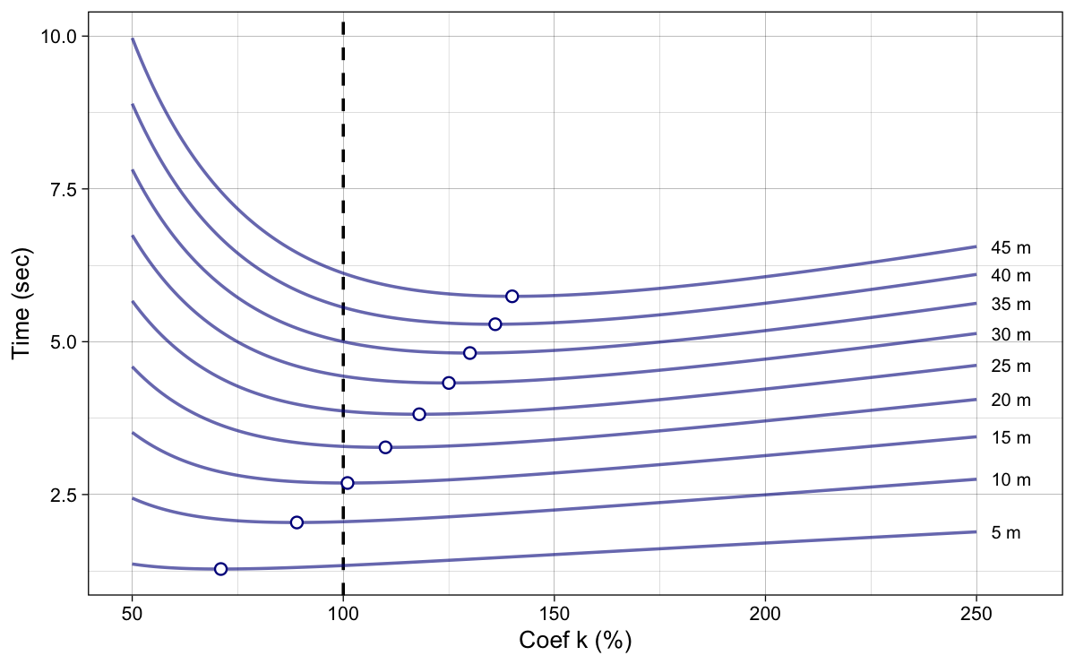
Figure 7: Model predicted split times. Dots represent the best (i.e., minimum) split times
Instead of using coefficient k on the x-axis, we can plot the calculated $S_{FV}^{new}$ (Equation 8). This is depicted in Figure 8. Now the dot represent the slope at which the split time is shortest (i.e., best). Vertical dashed line represent the original (or true, or initial) slope. Please note that calculated slope in Figure 8 is relative – it uses relative $F_0$ (i.e., $\frac{F_0}{BW}$).
Show/Hide Code
ggplot(model_sens_df, aes(x = new_slope, y = new_time, group = distance_label)) +
  theme_linedraw(8) +
  geom_vline(xintercept = model_sens_df$slope[1], linetype = "dashed") +
  geom_line(alpha = 0.6, color = "dark blue") +
  geom_point(
    data = model_sens_lowest_df,
    aes(x = new_slope, y = new_time, group = distance_label),
    color = "dark blue", fill = "white", shape = 21) +
  geom_dl(
    aes(label = paste("  ", distance_label)),
    method = list("last.bumpup", cex = 0.5)
  ) +
  ylab("Time (sec)") +
  xlab("Slope") +
  xlim(-3.5, 0)
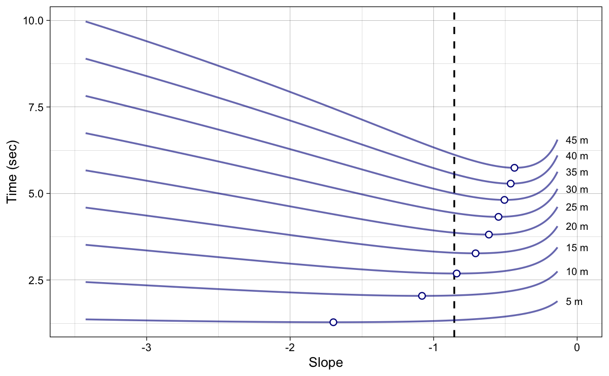
Figure 8: Model predicted split times. Dots represent the best (i.e., minimum) split times. Instead of using coefficient k, we are now using FV slope. Vertical dashed line represent the original (or true) slope
We are now interested in extracting these optimal slopes for a given distance. This is done using optimization method implemented in the {shorts} package (Jovanović and Vescovi 2022; Jovanović 2022). This method computationally finds the minimum split time by changing coefficient $k$. We call this slope for which the model predicted quickest split time the optimal slope $S_{AV}^{optim}$. The optimal slopes in Figure 9 are simply depicted slopes associated with minimal split times from Figure 8.
Show/Hide Code
ggplot(model_sens_lowest_df, aes(x = distance, y = new_slope)) +
  theme_linedraw(8) +
  geom_hline(yintercept = -athlete_MAC/athlete_MSS, linetype = "dashed") +
  geom_line(alpha = 0.6, color = "dark blue") +
  geom_point(color = "dark blue", fill = "white", shape = 21) +
  ylab("Optimal Slope") +
  xlab("Distance (m)")
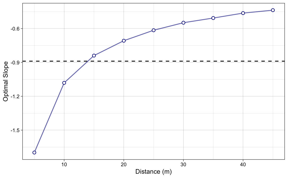
Figure 9: Optimal FV slopes, for which the model predicted quickest split time, across various sprint distances. In other words, these represents the dots from Figure 8. Horizontal dashed line represent the original (or true) slope
The next step is to calculate the Profile Imbalance (Profile_{IMB}) metric using Equation 9. Simply, the further the original slope is from the optimal slope, the more the profile is imbalanced.
\begin{split}
Profile_{IMB} = 100 \times\frac{S_{FV}}{S_{FV}^{optim}}\\\end{split}Equation 9
If $Profile_{IMB}$ is bigger than 100, then the profile is velocity deficient, and if it is lower than 100, the profile is force deficient (Figure 10).
Show/Hide Code
ggplot(model_sens_lowest_df, aes(x = distance, y = 100*(-athlete_MAC/athlete_MSS)/new_slope)) +
  theme_linedraw(8) +
  geom_hline(yintercept = 100, linetype = "dashed") +
  geom_line(alpha = 0.6, color = "dark blue") +
  geom_point(color = "dark blue", fill = "white", shape = 21) +
  annotate("segment", x = 4.5, xend = 4.5, y = 105, yend = 250, color = "dark grey",
           size = 1, arrow = arrow(type = "closed", length = unit(0.2, "cm"))) +
  annotate("text", x = 3.5, y = 175, size = 3, angle = 90, label = "Veloc Def", vjust = "bottom", color = "dark grey") +
  annotate("segment", x = 4.5, xend = 4.5, y = 95, yend = 50, color = "dark grey",
           size = 1, arrow = arrow(type = "closed", length = unit(0.2, "cm"))) +
  annotate("text", x = 3.5, y = 75, size = 3, angle = 90, label = "Force Def", vjust = "bottom", color = "dark grey") +
  ylab("Profile Imbalance (%)") +
  xlab("Distance (m)")
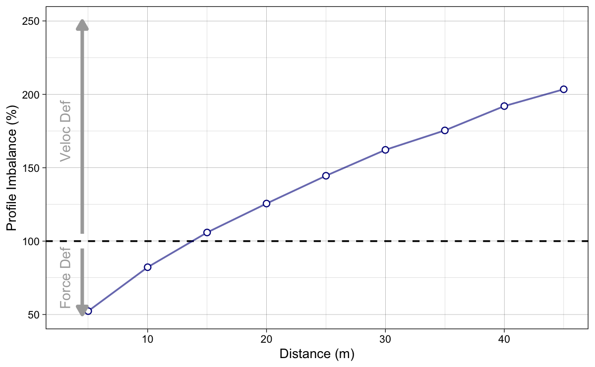
Figure 10: Profile Imbalance is calculated using $100 \times\frac{S_{FV}}{S_{FV}^{optim}}$
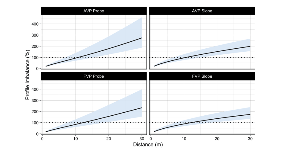
Figure 11 depicts the results of both probe and slope optimization method. As explained in the previous installment, I find the probe method more intuitive, since it is interested in estimating effects of hypothetical intervention on the model parameters, rather than trying to change slope while keeping magical $P_{max}$ the same.
Show/Hide Code
# Generate data
model_sens_df <- data.frame(
  F0 = athlete_F0,
  V0 = athlete_V0,
  BW = athlete_BW
  ) %>%
  expand_grid(distance = seq(1, 45, by = 1)) %>%
  mutate(
    `Probe method` = probe_FV(distance, F0, V0, bodymass = BW, bodyheight = athlete_height)$profile_imb,
    `Slope method` = optimal_FV(distance, F0, V0, bodymass = BW, bodyheight = athlete_height)$profile_imb) %>%
  pivot_longer(cols = c(`Probe method`, `Slope method`), names_to = "method", values_to = "profile_imb")

# Plot
ggplot(model_sens_df, aes(x = distance, y = profile_imb, color = method)) +
  theme_linedraw(8) +
  geom_hline(yintercept = 100, linetype = "dashed") +
  geom_line(alpha = 0.6) +
  geom_dl(
    aes(label = paste("  ", method)),
    method = list("last.bumpup", cex = 0.5)
  ) +
    annotate("segment", x = 0.5, xend = 0.5, y = 105, yend = 280, color = "dark grey",
           size = 1, arrow = arrow(type = "closed", length = unit(0.2, "cm"))) +
  annotate("text", x = 0, y = 200, size = 3, angle = 90, label = "Veloc Def", vjust = "bottom", color = "dark grey") +
  annotate("segment", x = 0.5, xend = 0.5, y = 95, yend = 20, color = "dark grey",
           size = 1, arrow = arrow(type = "closed", length = unit(0.2, "cm"))) +
  annotate("text", x = 0, y = 55, size = 3, angle = 90, label = "Force Def", vjust = "bottom", color = "dark grey") +
  ylab("Profile imbalance (%)") +
  xlab("Distance (m)") +
  xlim(0, 50) +
  scale_color_brewer(palette = "Set1") +
  theme(legend.position = "none")
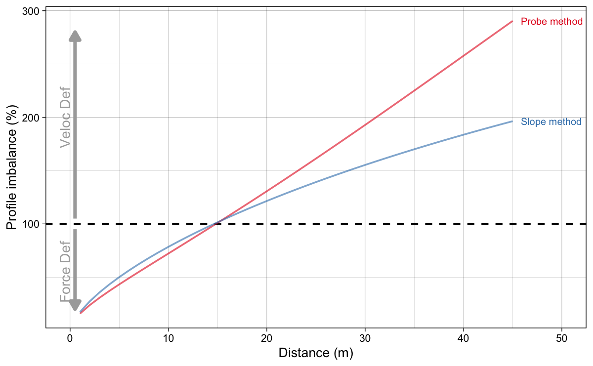
Figure 11: Profile Imbalance estimated using probe and slope method
Problem with $P_{max}$
As explained, the slope method changes slope by assuming $P_{max}$ (Equation 4) stays the same. Equation 4 is just a quick proxy and assumes linear relationship between force and velocity. As shown in previous installments, this is not the case. Figure 12 depicts how $P_{max}$, as expected, stays the same with changing coefficient $k$ (i.e., slope), but the actual model predicted peak power ($P_{peak}$) drops. This is due to not-exactly-linear relationship between force and velocity.
Show/Hide Code
# Generate data
model_sens_df <- data.frame(
  F0 = athlete_F0,
  V0 = athlete_V0,
  BW = athlete_BW
  ) %>%
  expand_grid(
    factor = seq(50, 250)) %>%
  rowwise() %>%
  mutate(
    Pmax = F0 * V0 / 4,
    Ppeak = shorts:::find_FV_peak_power(F0, V0, bodymass = BW, bodyheight = athlete_height),
    new_F0 = F0 / (factor / 100),
    new_V0 = V0 * (factor / 100),
    new_slope = -(new_F0 / BW)/new_V0,
    new_Pmax = new_F0 * new_V0 / 4,
    new_Ppeak = shorts:::find_FV_peak_power(
      new_F0,
      new_V0,
      bodymass = BW,
      bodyheight = athlete_height)
  ) %>%
  ungroup()

plot_df <- model_sens_df %>%
  select(factor, new_slope, new_Pmax, new_Ppeak) %>%
  rename(`Max Power` = new_Pmax, `Peak Power` = new_Ppeak) %>%
  pivot_longer(cols = c(`Max Power`, `Peak Power`), names_to = "power")

# Plot
ggplot(plot_df, aes(x = factor, y = value, color = power)) +
  theme_linedraw(8) +
  geom_vline(xintercept = 100, linetype = "dashed") +
  geom_line(alpha = 0.6) +
  ylab("Power (W)") +
  xlab("Coef k (%)") +
  geom_dl(
    aes(label = paste("  ", power)),
    method = list("last.bumpup", cex = 0.5)
  ) +
  scale_color_brewer(palette = "Set1") +
  theme(legend.position = "none") +
  xlim(50, 300)
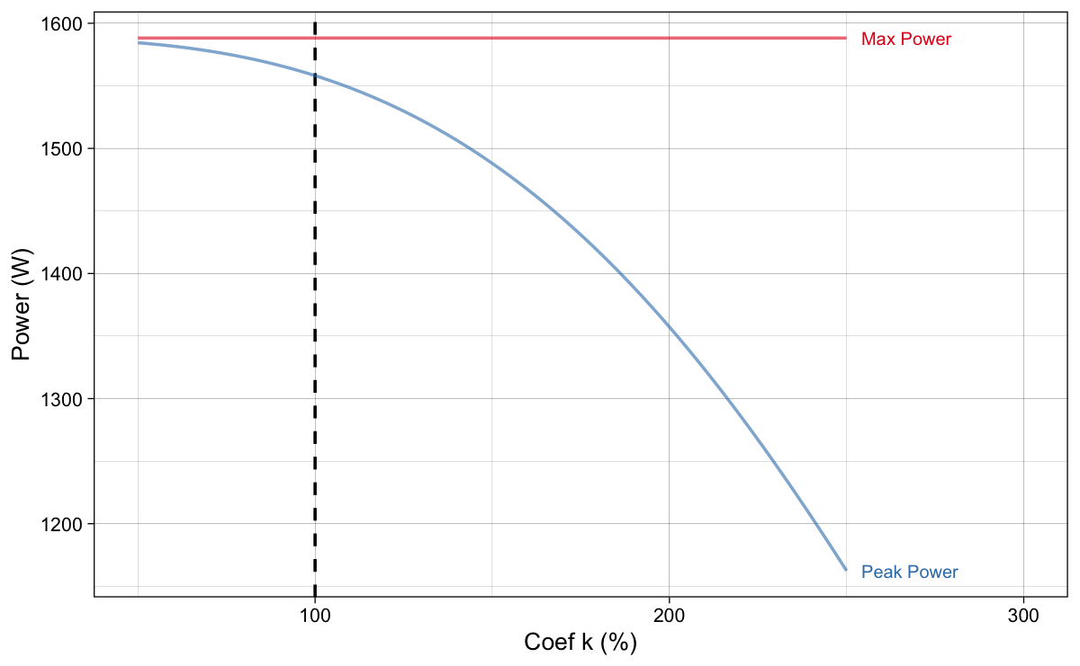
Figure 12: $P_{max}$, as expected, stays the same with changing coefficient $k$ (i.e., slope), but the actual model predicted peak power ($P_{peak}$) drops
Figure 13 depicts original (initial) $P_{max}$ and $P_{peak}$ as well as their values for the optimal profiles for given distance. As expected, $P_{max}$ stays the same (i.e., identical to the initial/original value) for optimal profiles, while the optimal profile $P_{peak}$ drops as the distance increases.
Show/Hide Code
# Generate data
model_sens_df <- data.frame(
  F0 = athlete_F0,
  V0 = athlete_V0,
  BW = athlete_BW
  ) %>%
  expand_grid(distance = seq(1, 45, by = 1)) %>%
  mutate(
    optimal_FV(distance, F0, V0, bodymass = BW, bodyheight = athlete_height)) %>%
  select(distance, Pmax, Ppeak, Pmax_optim, Ppeak_optim) %>%
  rename(`Optimal Pmax` = Pmax_optim, `Optimal Ppeak` = Ppeak_optim) %>%
  pivot_longer(-distance, names_to = "power")

# Plot
ggplot(model_sens_df, aes(x = distance, y = value, color = power)) +
  theme_linedraw(8) +
  geom_line(alpha = 0.6) +
  ylab("Power (W)") +
  xlab("Distance (m)") +
  geom_dl(
    aes(label = paste("  ", power)),
    method = list("last.bumpup", cex = 0.5)
  ) +
  scale_color_brewer(palette = "Set1") +
  theme(legend.position = "none") +
  xlim(0, 55) +
  ylim(1500, 1590)
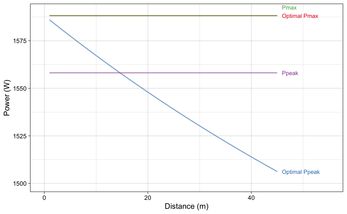
Figure 13: Original $P_{max}$ and $P_{peak}$ as well as their values for the optima profiles for given distance.
Is this bug or an error in the Samozino et al. (2022) method? Not necessarily so – it is just that the constraint of their model is to keep $P_{max}$ the same, rather than $P_{peak}$. But which one should be kept the same? $P_{max}$ or $P_{peak}$? They are both Small World (i.e., model constructs) if you ask me – I would prefer probe method for this very reason. But anyway, I will explain optimization method that keeps the $P_{peak}$ the same across changing the slope. I have named this method peak method, while Samozino et al. (2022) method I have named max method, to differentiate between the two.
Rather than changing $k$ coefficient, like in the original max method of optimization, peak method changes $F_{0}$, but then finds $V_0$ that yields the same initial $P_{peak}$. This is more involved (read: slower), since there are actually optimization-within-optimization (Figure 14).
Show/Hide Code
# Generate data
model_sens_df <- data.frame(
  F0 = athlete_F0,
  V0 = athlete_V0,
  BW = athlete_BW
  ) %>%
  expand_grid(
    method = c("max", "peak"),
    factor = seq(50, 250)) %>%
  rowwise() %>%
    mutate(
      Pmax = F0 * V0 / 4,
      Ppeak = shorts:::find_FV_peak_power(
        F0 = F0,
        V0 = V0,
        bodymass = BW,
        bodyheight = athlete_height),
    slope = -(F0 / BW)/V0,
    new_F0 = F0 * (factor / 100),
    new_V0 = ifelse(
      method == "max",
      V0 / (factor / 100),
      shorts:::find_V0(
      new_F0,
      Ppeak,
      bodymass = BW,
      bodyheight = athlete_height)),
    new_Pmax = new_F0 * new_V0 / 4,
    new_Ppeak = shorts:::find_FV_peak_power(
        F0 = new_F0,
        V0 = new_V0,
        bodymass = BW,
        bodyheight = athlete_height),
    new_slope = -(new_F0 / athlete_BW)/new_V0
  ) %>%
  ungroup() %>%
  select(method, factor, new_F0, new_V0, new_Pmax, new_Ppeak, new_slope) %>%
  rename(
    F0 = new_F0,
    V0 = new_V0,
    Pmax = new_Pmax,
    Ppeak = new_Ppeak,
    Slope = new_slope
  ) %>%
  pivot_longer(cols = -c(method, factor), names_to = "variable") %>%
  mutate(variable = factor(variable, levels = c("F0", "V0", "Slope", "Pmax", "Ppeak")))

# Plot
ggplot(model_sens_df, aes(x = factor, y = value, color = method)) +
  theme_linedraw(8) +
  geom_vline(xintercept = 100, linetype = "dashed") +
  geom_line(alpha = 0.6) +
  ylab(NULL) +
  xlab("F0 (%)") +
  geom_dl(
    aes(label = paste("  ", method)),
    method = list("last.bumpup", cex = 0.5)
  ) +
  facet_wrap(~variable, scales = "free_y") +
  scale_color_brewer(palette = "Set1") +
  theme(legend.position = "none") +
  xlim(50, 275)
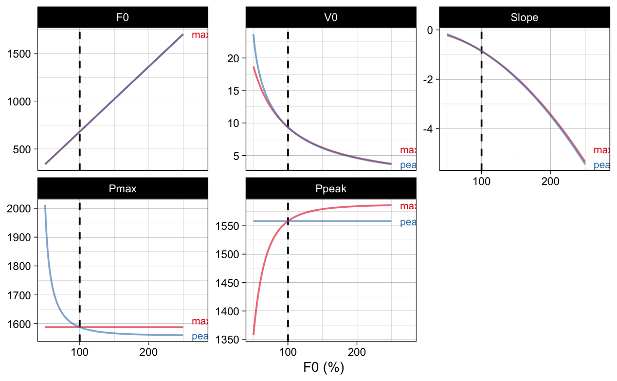
Figure 14: Rather than changing $k$ coefficient, like in the original $max$ method of optimization, peak method changes $F_{0}$, but then finds $V_0$ that yields the same initial $P_{peak}$
Figure 15 depicts estimated optimal values for $F_0$, $V_0$, $S_{fv}$, $P_{max}$, $P_{peak}$, and calculated profile imbalance. Please note the increase in the profile imbalance metric difference between the two methods.
Show/Hide Code
# Generate data
model_sens_df <- data.frame(
  F0 = athlete_F0,
  V0 = athlete_V0,
  BW = athlete_BW
  ) %>%
  expand_grid(
    distance = seq(1, 45, by = 1),
    method = c("max", "peak")) %>%
  mutate(
    optimal_FV(distance, F0, V0, bodymass = BW, bodyheight = athlete_height, method = method)) %>%
  select(distance, method, Pmax_optim, slope_optim, Ppeak_optim, F0_optim, V0_optim, profile_imb) %>%
  rename(
    `Optimal Pmax` = Pmax_optim,
    `Optimal Ppeak` = Ppeak_optim,
    `Optimal Slope` = slope_optim,
    `Optimal F0` = F0_optim,
    `Optimal V0` = V0_optim,
    `Profile Imbalance` = profile_imb) %>%
  pivot_longer(-c(distance, method), names_to = "variable") %>%
  mutate(
    variable = factor(variable, levels = c("Optimal F0", "Optimal V0", "Optimal Slope", "Optimal Pmax", "Optimal Ppeak", "Profile Imbalance"))
  )

# Plot
ggplot(model_sens_df, aes(x = distance, y = value, color = method)) +
  theme_linedraw(8) +
  geom_line(alpha = 0.6) +
  ylab(NULL) +
  xlab("Distance (m)") +
  geom_dl(
    aes(label = paste("  ", method)),
    method = list("last.bumpup", cex = 0.5)
  ) +
  facet_wrap(~variable, scales = "free_y") +
  scale_color_brewer(palette = "Set1") +
  theme(legend.position = "none") +
  xlim(0, 55)
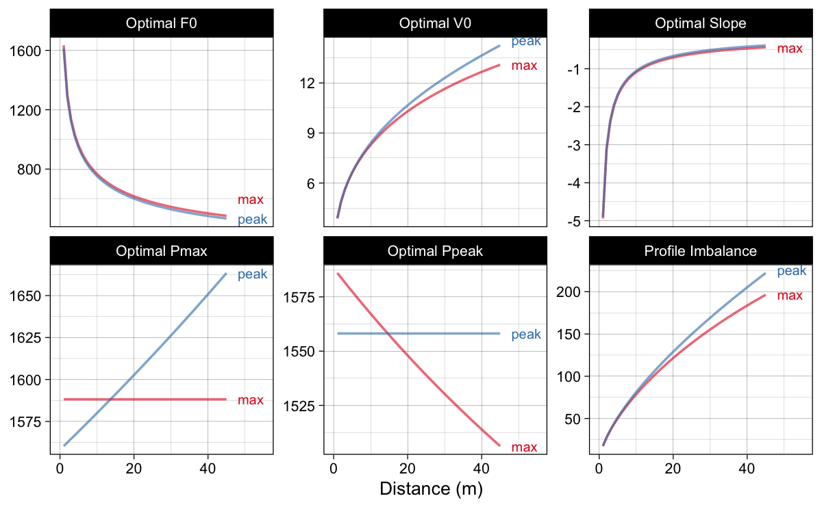
Figure 15: Estimated optimal values using max and peak methods
The {shorts} package (Jovanović and Vescovi 2022; Jovanović 2022) allows you to utilize all mentioned methods to find out profile imbalance (Figure 16). One of the key messages here is that there is not a single way to perform this “optimization” sensitivity fuck-around-and-find-out, but multitude of them. And they are all optimizing our “Small World” model. That is useful, but let us not confuse the Map for the Territory.
Show/Hide Code
# Generate data
model_sens_df <- tibble(MSS = athlete_MSS, MAC = athlete_MAC) %>%
  mutate(data.frame(
  make_FV_profile(
    MSS,
    MAC,
    bodymass = athlete_BW,
    bodyheight = athlete_height) [c("F0_poly", "V0_poly")]
  )) %>%
  expand_grid(distance = seq(1, 45, by = 1)) %>%
  mutate(
    `Optimal AVP` = optimal_MSS_MAC(distance, MSS, MAC)$profile_imb,
    `Probe AVP` = probe_MSS_MAC(distance, MSS, MAC, perc = 5)$profile_imb,
     `Probe FVP` = probe_FV(distance, F0_poly, V0_poly, bodymass = athlete_BW, bodyheight = athlete_height, perc = 5)$profile_imb,
    `Optimal FVP (Pmax)` = optimal_FV(distance, F0_poly, V0_poly, bodymass = athlete_BW, bodyheight = athlete_height)$profile_imb,
    `Optimal FVP (Ppeak)` = optimal_FV(distance, F0_poly, V0_poly, bodymass = athlete_BW, bodyheight = athlete_height, method = "peak")$profile_imb) %>%
  pivot_longer(-c(MSS, MAC, F0_poly, V0_poly, distance), names_to = "method")

# Plot
ggplot(model_sens_df, aes(x = distance, y = value, color = method)) +
  theme_linedraw(8) +
  geom_hline(yintercept = 100, linetype = "dashed") +
  geom_line(alpha = 0.6) +
  annotate("segment", x = 0.5, xend = 0.5, y = 105, yend = 350, color = "dark grey",
           size = 1, arrow = arrow(type = "closed", length = unit(0.2, "cm"))) +
  annotate("text", x = 0, y = 250, size = 3, angle = 90, label = "Veloc Def", vjust = "bottom", color = "dark grey") +
  annotate("segment", x = 0.5, xend = 0.5, y = 95, yend = 20, color = "dark grey",
           size = 1, arrow = arrow(type = "closed", length = unit(0.2, "cm"))) +
  annotate("text", x = 0, y = 55, size = 3, angle = 90, label = "Force Def", vjust = "bottom", color = "dark grey") +
  ylab("Profile Imbalance (%)") +
  xlab("Distance (m)") +
  geom_dl(
    aes(label = paste("  ", method)),
    method = list("last.bumpup", cex = 0.5)
  ) +
  scale_color_brewer(palette = "Set1") +
  theme(legend.position = "none") +
  xlim(0, 55)
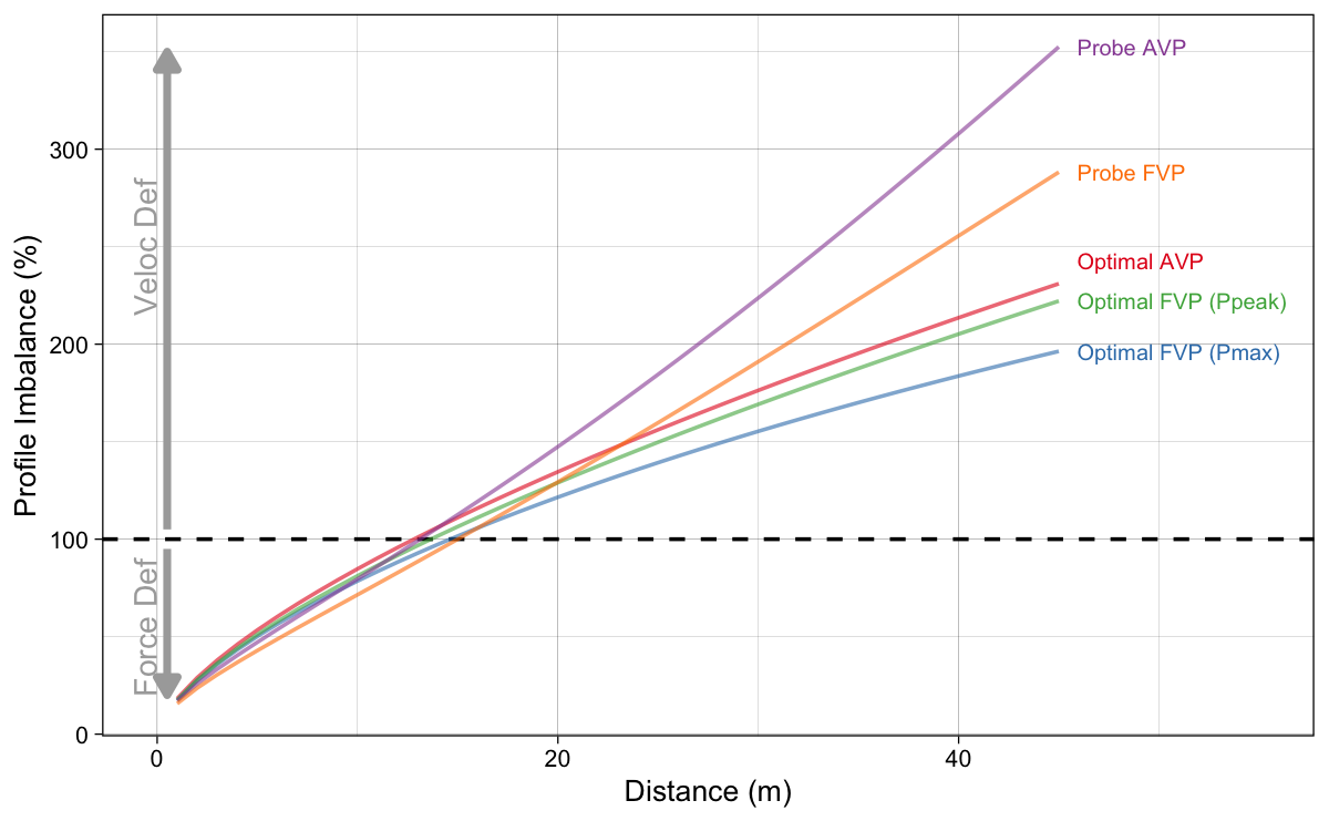
Figure 16: Results of estimated profile imbalance metric using all introduced methods
References
- Jovanović, Mladen. 2022. Shorts: Short Sprints. https://cran.r-project.org/package=shorts.
- Jovanović, Mladen, and Jason Vescovi. 2022. “Shorts: An r Package for Modeling Short Sprints.” International Journal of Strength and Conditioning 2 (1). https://doi.org/10.47206/ijsc.v2i1.74.
- Samozino, Pierre, Nicolas Peyrot, Pascal Edouard, Ryu Nagahara, Pedro Jimenez-Reyes, Benedicte Vanwanseele, and Jean-Benoit Morin. 2022. “Optimal Mechanical Force–Velocity Profile for Sprint Acceleration Performance.” Scandinavian Journal of Medicine & Science in Sports 32 (3): 559–75. https://doi.org/10.1111/sms.14097.


Responses