Fat Tails and Inequality
Introduction
The following R workbook is meant to show different effects (or should I call them inequalities or differences) between groups when different thresholds for selection are applied. Hopefully, this will be a good example on how it is important to be statistically educated when comparing groups and discussing inequality.
Let’s assume we have two groups of people: Group A and Group B (that can be any group differentiated based on whatever criteria, usually gender, race, nationality, experience and so forth) with a given Quality (where quality can be anything, from IQ, to personality traits, to income, or to physical traits). Let’s assume that this quality is normally distributed (although it can be a power law distribution as well, but for the sake of simplicity let’s stick to normal distribution) with the mean of 100 a.u. for both groups and standard deviation (SD) of 14 for group A and 16 for group B. In both groups we have N=10,000 people.
# This is used so that you can reproduce the exact same numbers with the random number generator
set.seed(16667)

N <- 10000
groupA <- rnorm(n = N, mean = 100, sd = 14)
groupB <- rnorm(n = N, mean = 100, sd = 16)
Here is the distribution plot of the two group on top of each other, with dashed vertical line representing mean of the groups
require(tidyverse)
require(plotly)
require(hrbrthemes)

# GGplot theme for all the graphs
theme_bmbp <- function(...) {
    theme_ipsum(base_family = "Helvetica", axis_text_size = 8)
}

# Colors for graphs
bmbp_blue <- "#5DA5DA"
bmbp_red <- "#F15854"
bmbp_gray <- "#4D4D4D"
bmbp_green <- "#60BD68"

df <- data.frame(groupA = groupA, groupB = groupB)
df <- gather(df, key = "Group", value = "Quality")

gg <- ggplot(df, aes(Quality, fill = Group)) +
      theme_bmbp() +
      geom_density(alpha = 0.5) +
      geom_vline(aes(xintercept = mean(Quality), color = Group), linetype = "dashed") +
      scale_fill_manual(values=c(bmbp_blue, bmbp_red)) +
      scale_color_manual(values=c(bmbp_blue, bmbp_red))
ggplotly(gg)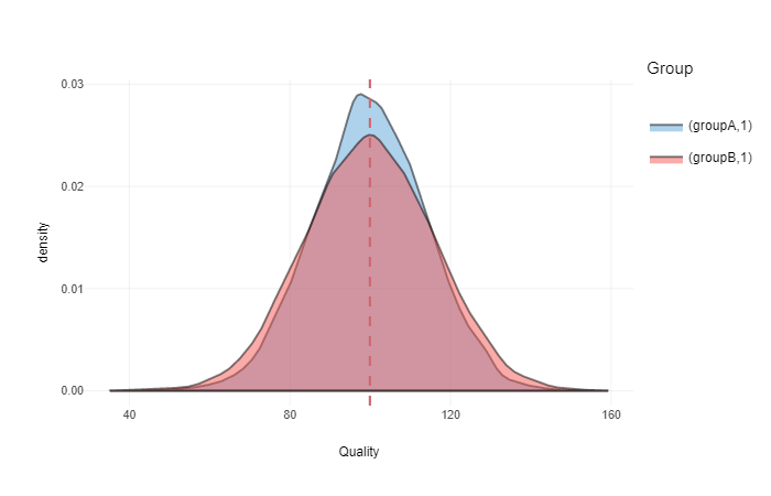
Common language effect size (CLES) and ratio of people/subjects
As can be seen from the image, groups are equal (means are equal, but group B has slightly more spread due higher SD). What might interest us is how likeliy a random person from the group B is higher in quality than a random person from the group A. This is called common language effect size (CLES). CLES goes from 0 to 1, where 0.5 is 50:50 chance (means that groups are equal).
Let’s write a simple function to calculate CLES using brute force method (simple counting, although one can use algebraic method assuming normal distribution within groups):
# Function for calculating common language effect sizes using "brute force" method
CLES <- function(groupA, groupB) {
    combinations <- expand.grid(groupA = groupA, groupB = groupB)

    differences <- combinations$groupB - combinations$groupA
    higher <- differences > 0
    lower <-  differences < 0

    return(sum(higher) / (sum(lower) + sum(higher)))
}
Let’s calculate CLES for our group A and group B:
clesAB <- CLES(groupA, groupB)In our case CLES is equal to 0.5, or 50:50 chance that a random person from group B will be higher than a random person from group A. This means that the groups are equal.
Let’s suppose that a given strata (or subgroup) involve people over 100 a.u. in quality (which is mean to both groups). This can be result of a competition or some hiring process (for example I want to hire above average persons from group A and group B). This is how our graph looks now:
ggplotly(gg +
         coord_cartesian(xlim = c(100, 160)))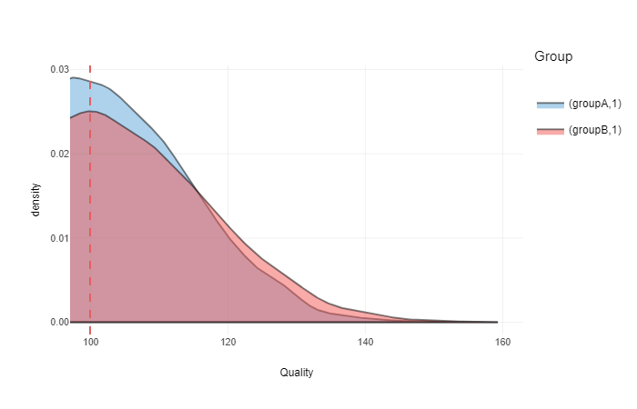
Now we have a strata of people of 100a.u. in quality. What is CLES in this strata?
clesABover100 <- CLES(groupA[groupA > 100], groupB[groupB > 100])In this case CLES is equal to 0.54. This means that a random person from group B is not likely to be higher in quality than a random person from group A.
What about ratio of people from group A and group B over 100 a.u.?
ratioABover100 <- sum(groupB > 100) / sum(groupA > 100)Ratio of people over 100 a.u. is 1. This means that number of people from group B and number of people from group A over 100 a.u. are equal. Thus, if someone is looking for pool of people over 100 a.u., then equal ammount of people will be available from group A and group B.
So, let’s now suppose that we have a threshold set at 120 a.u. This might be a high level competition or a task that demans highest levels of quality. Here is our distribution graph in this zone:
ggplotly(gg +
         coord_cartesian(xlim = c(120, 160), ylim = c(0, 0.015)))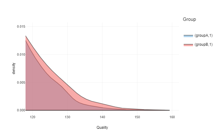
What is CLES in this strata (>120 a.u.)?
clesABover120 <- CLES(groupA[groupA > 120], groupB[groupB > 120])In this case CLES is equal to 0.56. And again, in this strata (>120 a.u.) random person from group B is not likely to be higher in quality than a random person from group A.
What about ratio of people?
ratioABover120 <- sum(groupB > 120) / sum(groupA > 120)Ratio of people over 120 a.u. is 1.37. This means that there will be more people from group B than from group A that will be available for selection when threshold is over 120 a.u.
What about if we increase this threshold to 140 a.u.? This can be extreme competition or selection process. Here is the graph:
ggplotly(gg +
         coord_cartesian(xlim = c(140, 160), ylim = c(0, 0.0015)))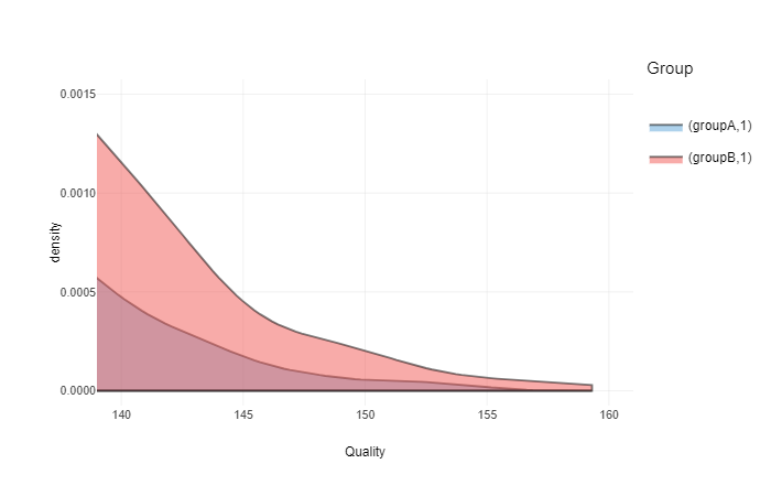
What is CLES in this strata (>140 a.u.)?
clesABover140 <- CLES(groupA[groupA > 140], groupB[groupB > 140])In this case CLES is equal to 0.56. This means that in this strata (>140 a.u.) random person from group B is not likely to be higher in quality than a random person from group B. Please note that this could be due ‘brute force’ method employed and lack of ‘cases’ in this fat tail (strata).
What about ratio of people?
ratioABover140 <- sum(groupB > 140) / sum(groupA > 140)Ratio of people over 140 a.u. is 2.59. This means that there will much more people from group B than people from group A in this strata (>140 a.u.).
Take home message
As can be seen from this little R example, due just small difference in SD between groups, even if their means are equal, there could be huge inequalities at extremes (in terms of ratios). This also works both ways – here we only checked extreme to the right, but similar inequalities exist on the left side (e.g. for every person with extremly high score in quality in group B, there is also person with extremely low score in quality in group B). In normal distribution these extreme tails are not that big, and can be much bigger in non-linear distributions (e.g. power law), also refered to as fat tails.
Here is an example of how ratios between groups change over different threshold in quality (assuming normal distribution with mean 100 and SD 14 in group A) when SD in group B is higher from 0 to 3 (mean 100 and SD from 14 to 17):
require(directlabels)

df <- data.frame(sdDiff = numeric(0),
                 threshold = numeric(0),
                 ratio = numeric(0))

for (sdDiff in seq(0, 3, by = 0.25)) {
    for (threshold in seq(50, 150, length.out = 200)) {
        if (threshold < 100) {
            groupA <- pnorm(threshold, 100, sd = 14)
            groupB <- pnorm(threshold, 100, sd = 14 + sdDiff)
        } else {
            groupA <- 1 - pnorm(threshold, 100, sd = 14)
            groupB <- 1 - pnorm(threshold, 100, sd = 14 + sdDiff)
        }

        df <- rbind(df, data.frame(sdDiff = sdDiff,
                                   threshold = threshold,
                                   ratio = groupB / groupA))
    }
}

gg <- ggplot(df, aes(x = threshold, y = ratio, group = sdDiff)) +
      theme_bmbp() +
      geom_line() +
      geom_dl(aes(label = sdDiff),
              method = list(dl.trans(x = x + .1), cex = 0.75, "last.points"), color = "dark grey") +
      geom_dl(aes(label = sdDiff),
              method = list(dl.trans(x = x - .1), cex = 0.75, "first.points"), color = "dark grey") +
      coord_cartesian(ylim = c(0, 10))
gg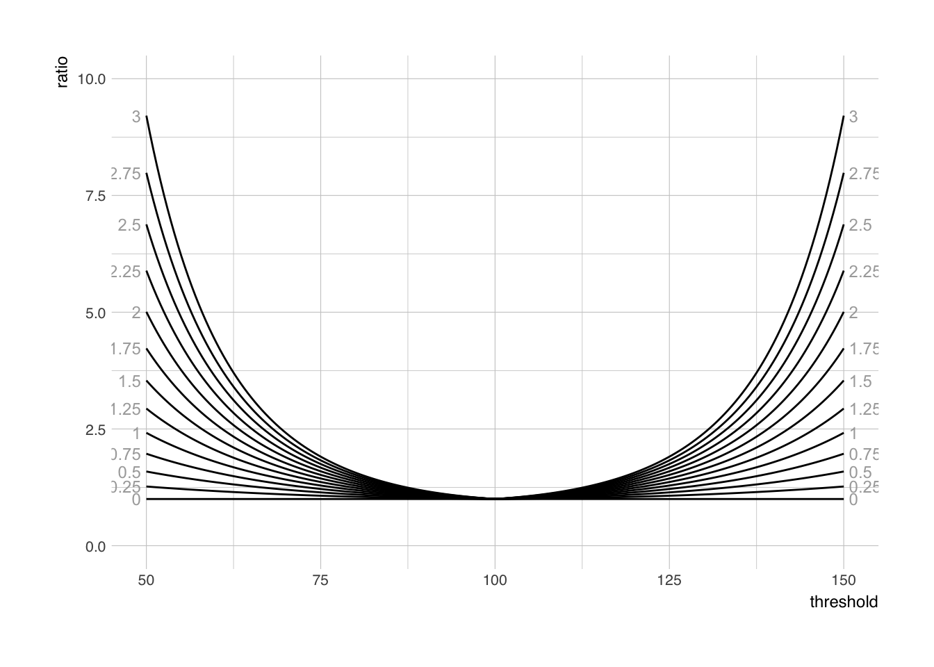
Take home message is that one cannot claim inequalities between groups when extreme strata are used. Just as small difference in SD between two groups can bring huge inequalities at the extremes. Learn the stats – don’t be an ignorant dumbfuck!


Responses